CSS filters can be used to affect how an image is presented. It is an exciting CSS feature that allows you to apply a filter on the background of an element. It may also be used with CSS animation to produce eye-catching effects and provide life to an otherwise static element. So, in this post, we’ve gathered 21 Stunning CSS Image & Text Effect Blur Examples that might be used in a future project or for learning a new technique in your quest to learn more about front-end development.
The CSS “filter” attribute gives an element visual effect. As a result, you may apply the “blur” effect to an element using the CSS syntax “filter: blur().” The “blur” filter gives the element a gaussian blur.
You may modify the blur strength by selecting several pixels for the screen to mix into each other. The Blur becomes more extreme as the pixel value increases.
1. Cross-Browser Image Blur with Transition
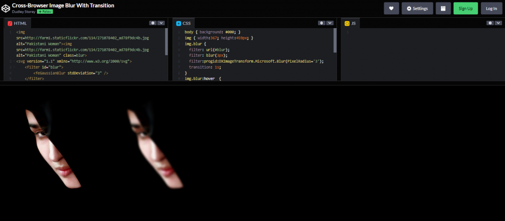
Made With: HTML and CSS
Author: Dudley Storey
Compatible With: Chrome, Edge, Firefox, Opera, Safari
2. Rollover CSS Blur Filter Image Gallery
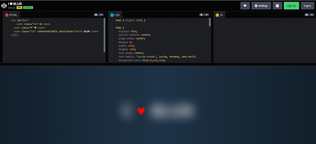
Made With: HTML and CSS
Author: Simurai
Compatible With: Chrome, Edge, Firefox, Opera, Safari
3. Rollover CSS Blur Filter Image Gallery
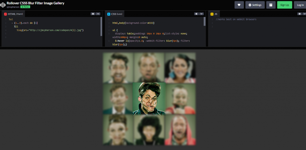
Made With: HTML (Haml) and CSS (less)
Author: Sjmcpherson
Compatible With: Chrome, Edge, Firefox, Opera, Safari
4. Pure CSS Text Blur
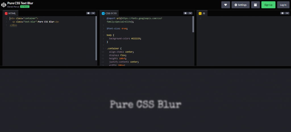
Author: Derek Peruo
Compatible With: Chrome, Edge, Firefox, Opera, Safari
5. Hover Effect Blur
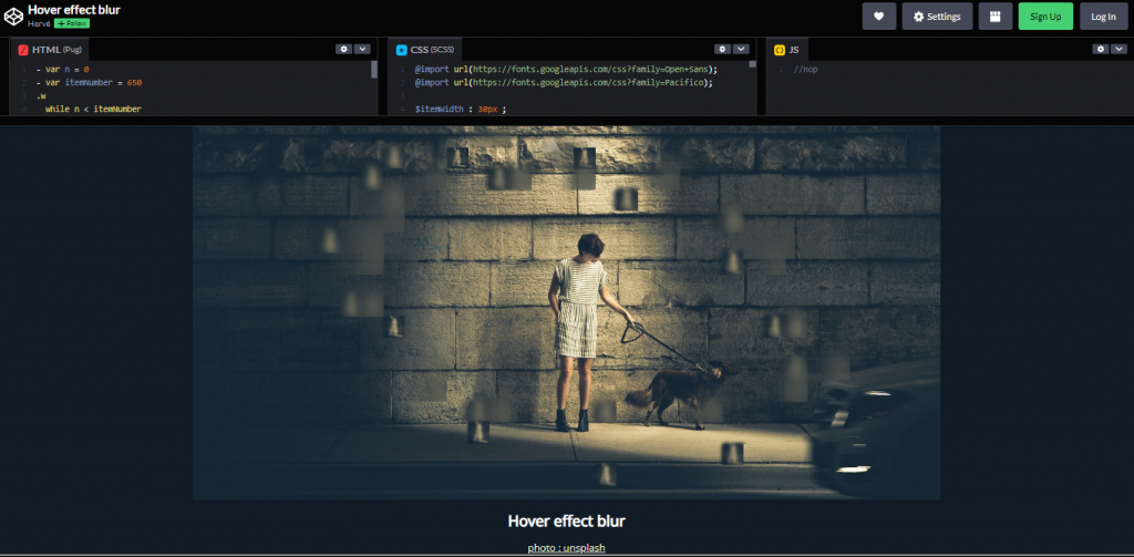
Made With: HTML (pug) / CSS(SCSS)
Author: Herve
Compatible With: Chrome, Edge, Firefox, Opera, Safari
6. Text Blurring Animation
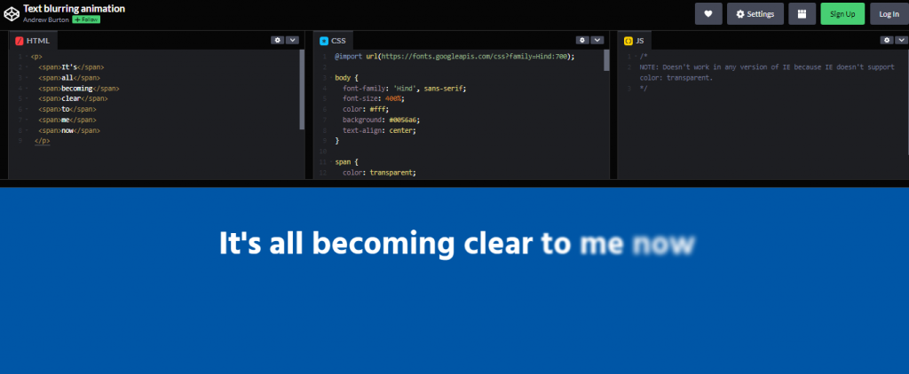
Made With: HTML and CSS
Author: Andrew Burton
Compatible With: Chrome, Edge, Firefox, Opera, Safari
7. In/out of Focus Text Effect
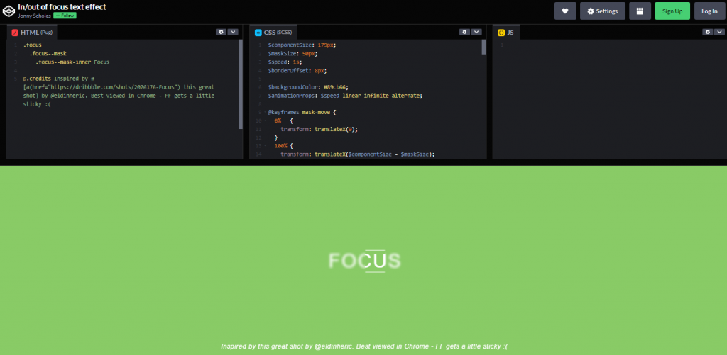
Made With: HTML (pug) and CSS
Author: Jonny Scholes
Compatible With: Chrome, Edge, Firefox, Opera, Safari
8. A Blurred Overlay
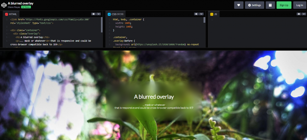
Made With: HTML and CSS
Author: Glenn Reyes
Compatible With: Chrome, Edge, Firefox, Opera, Safari
9. Loading Animation CSS
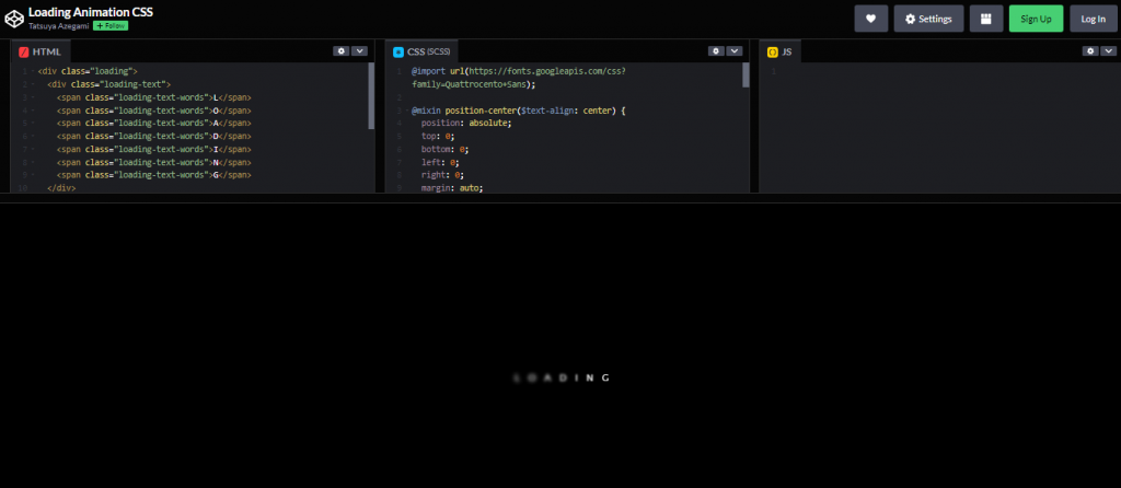
Made With
Author
Compatible With
10. Blur Buttons
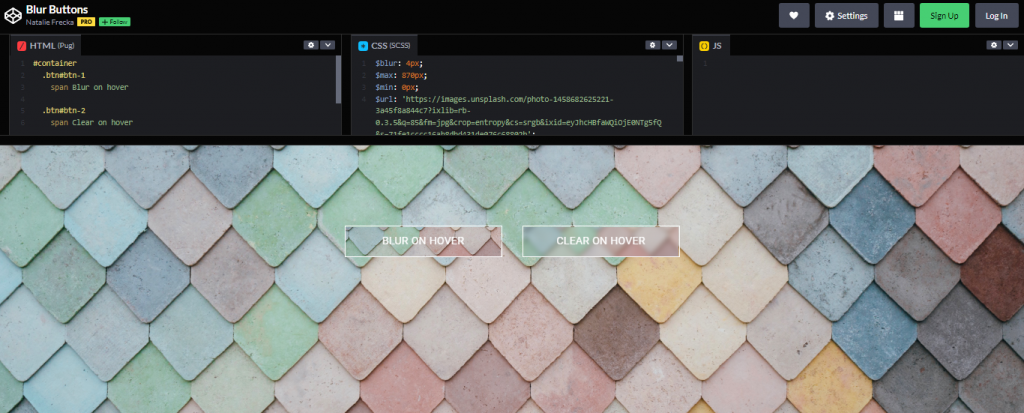
Made With: HTML and CSS
Author: Natalie Frecka
Compatible With: Chrome, Edge, Firefox, Opera, Safari
11. Blurred, Invincible, and Redacted Text
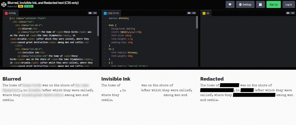
Made With: HTML and CSS
Author: Adam Ruff
Compatible With: Chrome, Edge, Firefox, Opera, Safari
12. Pure CSS Motion Blur
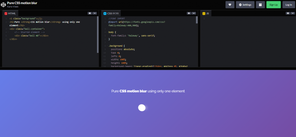
Made With: HTML and CSS
Author: Karlo Videk
Compatible With: Chrome, Edge, Firefox, Opera, Safari
13. Shifting Depth of Field
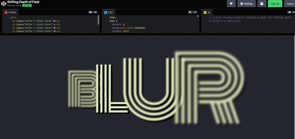
Made With: HTML and CSS
Author: Thomas Trinca
Compatible With: Chrome, Edge, Firefox, Opera, Safari
14. CSS Directional Motion Blur
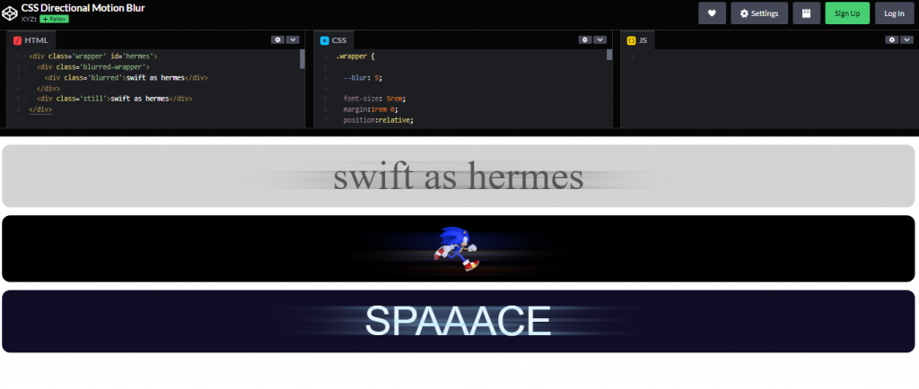
Made With: HTML and CSS
Author: XYZt
Compatible With: Chrome, Edge, Firefox, Opera, Safari
15. Full Bleed Background images with CSS3
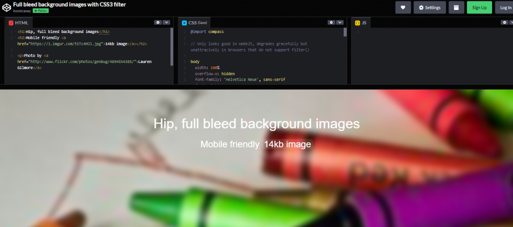
Made With: HTML and CSS
Author: unknown
Compatible With: Chrome, Edge, Firefox, Opera, Safari
16. Dynamic Inside Blur Pure CSS
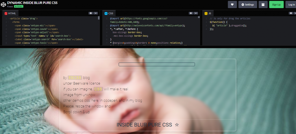
Made With: HTML, CSS and JS
Author: Unknown
Compatible With: Chrome, Edge, Firefox, Opera, Safari
17. Intrinsic Ratio Blur
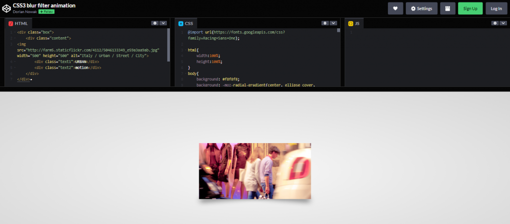
Made With: HTML, CSS and JS
Author
Compatible With
18. Text Over Any Background
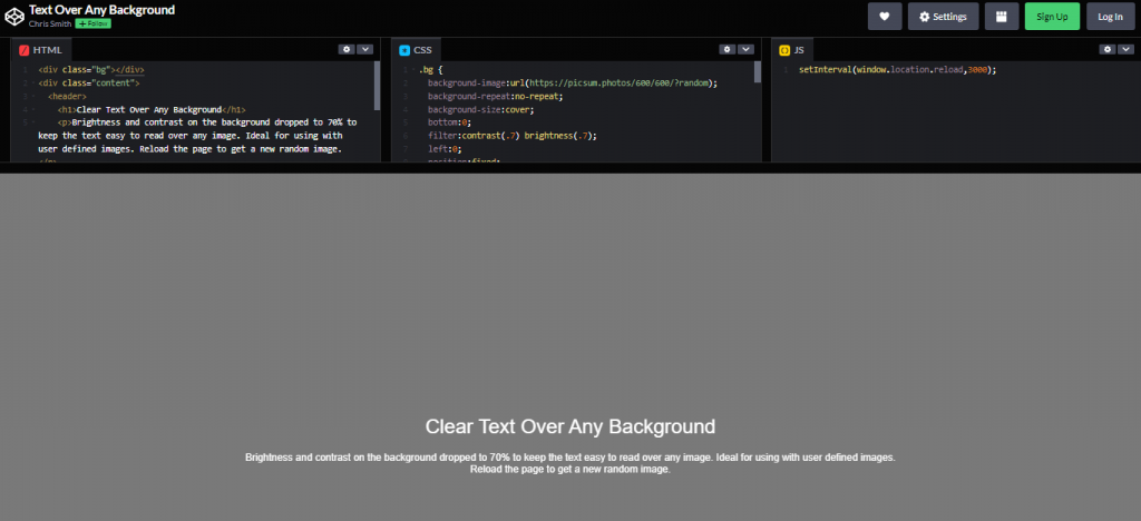
Made With: HTML, CSS and JS
Author: Unknown
Compatible With: Chrome, Edge, Firefox, Opera, Safari
19. Progressive Blur with CSS and SVG
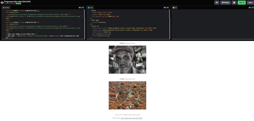
Made With: HTML and CSS
Author: Unknown
Compatible With: Chrome, Edge, Firefox, Opera, Safari
20. Light Box with Zoom and Blur Effect
Made With
Author
Compatible With
21. Draggable Blur Mask
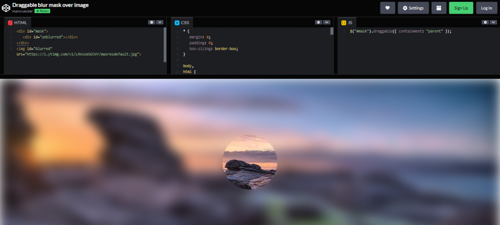
Made With
Author
Compatible With
Conclusion
When used incorrectly or too frequently, Blur can give your users the impression that they are visiting your site after a week-long binge, giving them a headache. Effect blur is frequently paired with a “undo” transition to remedy this.
The blur effect is identical to the Gaussian Blur filter in PhotoShop; because of its inclusion in CSS and SVG, we can now get the same results on the web.
