One of the frequently used input fields is the date. As a developer who understands the importance of a great user design, you know how a calendar can make it easy for your system, website, or mobile application users to input this value easily. It also guarantees accurate capture of this particular value, especially if it will capture the importance of other fields such as age. As much as it is essential, you don’t need to code that from scratch. On the contrary, you can use readily available codes. This article focuses on some CSS calendar grid code examples worth considering. Check them out!
1. CSS grid calendar
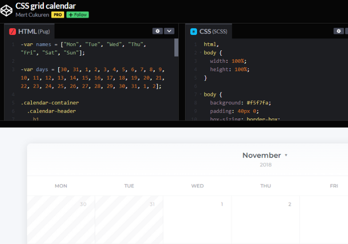
As the name suggests, this is a CSS calendar grid code example that you can learn a lot from the next time you want to implement such. Its author is Mert Cukuren. It displays the month, year, day, and date, and all the user has to do is select what’s appropriate. Besides dates, it is also ideal for scheduling. The user gets to set a reminder of what needs to be done on a particular day. The schedule can also be within a particular period.
2. Flexbox Responsive Calendar
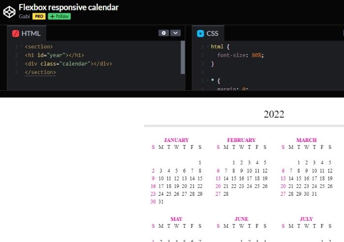
It is also one of the 10 CSS calendar grid examples discussed in this article. It displays the year right on top. Then, there is the alignment of all the 12 months of the year. Expect the different days of these months and their respective dates. They are in 4 rows and three columns, making the calendar presentable and visually appealing. There is also the blend of black and pink, which is the icing on the cake. Its author is none other than Gabi.
3. Calendar Mockup
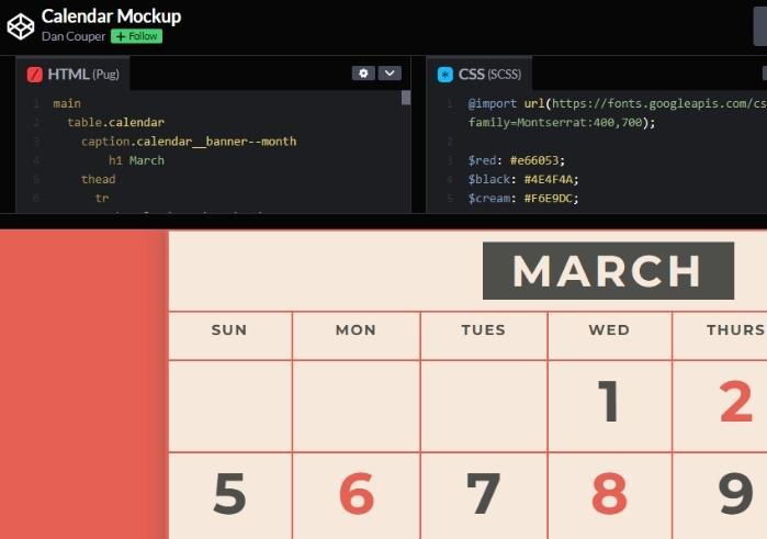
Dan Couper has also done an impressive job coming up with this great CSS calendar grids code example. His approach is quite different from that discussed above since the code focuses on a particular month instead of the entire year. That specific month is usually on top of the calendar with great font, font size, and color, not forgetting the great background. So, rest assured that it will always be conspicuous.
The days of the week follow the month, followed by the different dates. Then there are the special dates illustrated with a hard-to-miss background color. The alternating red and black colors are impressive.
4. Responsive Flexbox Calendar w/ Retina Images
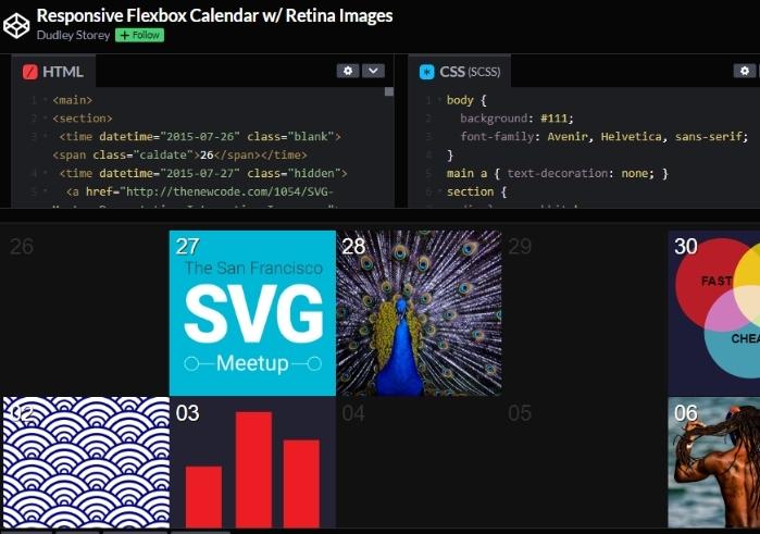
The uniqueness of this output makes it qualify to be one of the 10 CSS calendar grids code examples on our list. The month’s dates are in colorful grids hence beautiful and easy to notice. You are at liberty to add a background photo to these grids.
Interestingly, expect an animation effect once you hover over the image in the grid. The print will fade away, and some writings will show up. Not all the grids need to have the background image or text upon hovering over it. These additional features could be used to mark special days instead. The author of this fantastic CSS calendar grids code example is Dudley Storey.
5. DailyCssImages – Day 9. Calendar
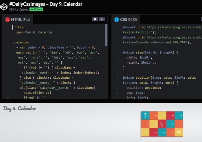
We have another option for someone looking for a great CSS calendar grid. Whether it is the arrangement or the combination of colors, this calendar grid is incredible. For instance, the first grid contains the month, date, and day of the week of the current day. There is another grid in the middle of the calendar indicating the time.
Equally important, expect the last grid to display the current year. The rest of the grids contain various months and their respective days. It is important to note that multiple grids have different background colors for beauty, and that has served the purpose perfectly. Its author is Nikita Dubko.
6. CSS Grid calendar
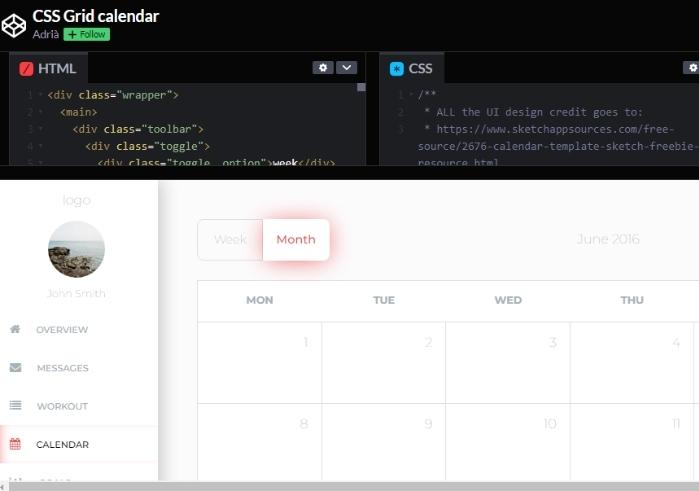
If you are looking for something that serves the purpose while maintaining its simplicity, this is a deal to consider. It displays one month at a time. There are also the days of the week and the different dates under them. On top of the calendar grid, we also have the name of the month, year, and a search button. Other than the fact that the author is Adria, there is nothing else to say about this CSS calendar grids code example.
7. CSS Grid Calendar
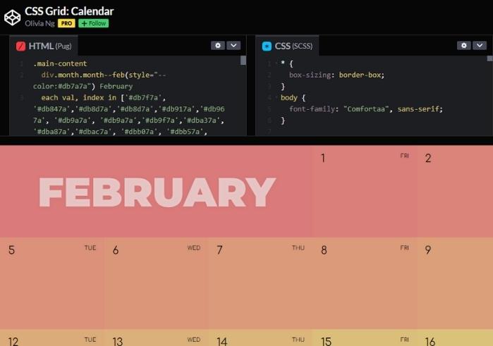
The next on our discussion of the 10 CSS calendar grids code examples worth considering is this excellent work by Olivia Ng. The calendar grid displays one month after the other. Thanks to the conspicuous names, it is easy to tell the end of one month and the beginning of the other. Each grid contains the date and the day so expect something like one and MON in a particular grid. Due to the various background colors for the different grids and rows, the calendar looks great, no doubt.
8. A Coder’s Advent Calendar
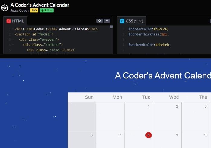
THANKS TO ITS SNOWY BACKGROUND. The CSS calendar grid code example is easy to notice. The days of the weeks are on the top-most row, whereas the grids below it have different dates below their respective days. That doesn’t mean the grids are hard to miss either. They have different shades of grey for the inner and out columns, and that’s amazing. The author is Jesse Couch.
9. Circular Calendar Display
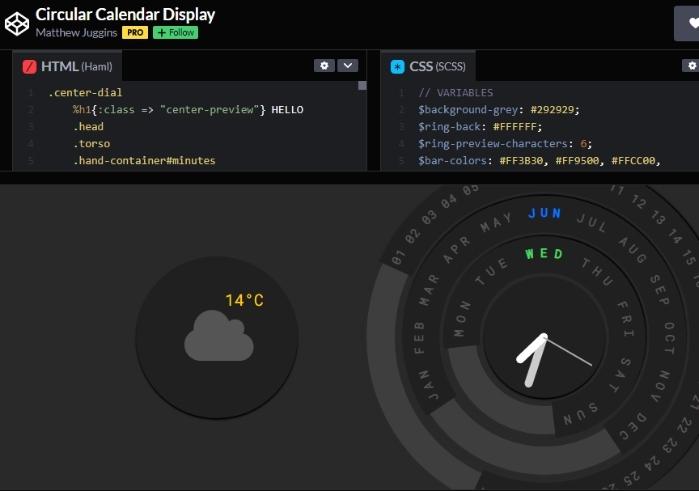
This example is also unique because it adopts a distinctive circular structure. It displays three circles showing different things. One shows the temperature, whereas the other one says the day of the week. Then there is the big circle showing the time, date, month, and day. So, if you are looking for a breath of fresh air, do not hesitate to give the code a shot. The creator of this great piece is Matthew Juggins.
10. CSS-only Colorful Calendar Concept
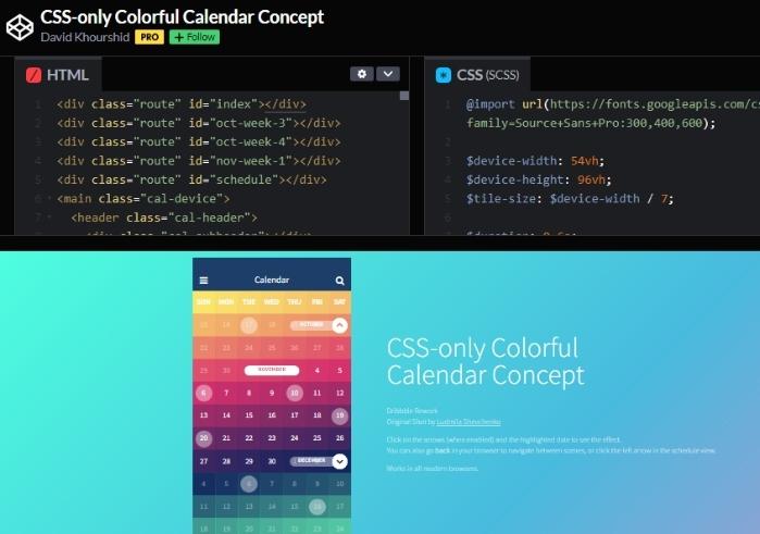
Last but not least, here is this beautiful CSS calendar grids code example by David Khurshid. It combines various colors to bring out beauty while catching one’s attention quickly too. You can use the up or bottom arrows to view the rest of the months and the date. The days of the week and the names of the other months also stand out.
