You’ll need two pictures (I’m using SVG for this sample, but regular photographs would suffice). Add the appropriate class to each image.) and change the opacity to 0; We set it to 0 because we’ll use @keyframes to change their opacity later, so the photos appear in the animation at specific points. The fact that we can specify an exceedingly exact rotation radius to generate an effect that seems like the coin is genuinely flipping is something we enjoy about this animation.
The dimensions for the pictures inside the coin are specified using the—image-container class. As indicated in the sample below, you must also provide this for the photos. Then we fix it. coin-style, which is the outside section of the coin (the coin itself). Technically, this could be turned to translucent, but for the sake of demonstration, we’ll leave it visible.
The fundamental idea behind the.coin-style class is how we add the animation, which in this instance is: animation: coin-flip 1.25s cubic-bezier(0.93, 0.05, 0.9, 0.71) infinite alternative;
The cubic-bezier() specification is particularly relevant since it provides the spinning curve effect for the coin container. Because writing this on your own is very hard, I propose using any curve-generating program to achieve the required look.
Finally, we use the scale() method within our @keyframes to adjust the coin’s look on an x-axis basis. Even the tiniest modification to the parameters supplied (in this demo) will vary the appearance of the “flip” effect.
1. The 3D transformations and CSS animation constructed a spinning Great British Pound coin.
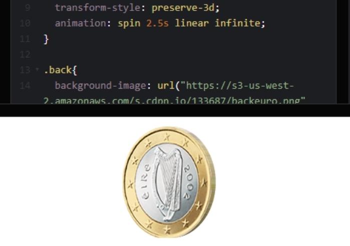
Made with: HTML and CSS
Author: Jason Hibbs
Compatible with: Chrome, Edge, Firefox, Opera, Safari
2. Spinning One EuroCoin
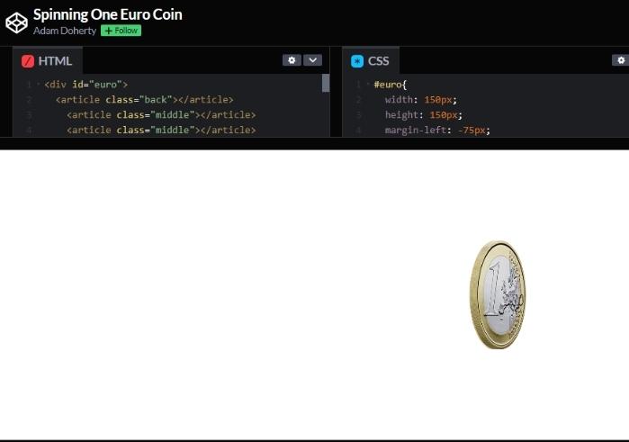
Made with: HTML and CSS
Author: Adam Doherty
Compatible with: Chrome, Edge, Firefox, Opera, Safari
3. Coin Flip
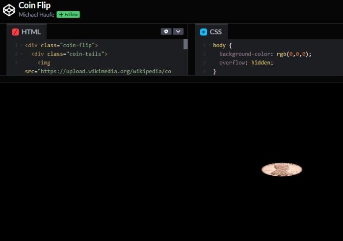
Made with: HTML and CSS
Author: Michael Haufe
Compatible with: Chrome, Edge, Firefox, Opera, Safari
4. Coin
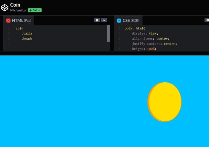
Made with: HTML and CSS
Author: Michael Lai
Compatible with: Chrome, Edge, Firefox, Opera, Safari
5. Golden Coin
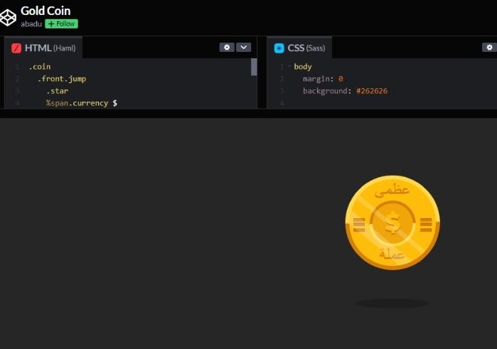
A beautiful gold coin made with HTML and SASS/CSS. This coin looks like a digital stock currency
Made with: HTML(Haml) and CSS(SASS)
Author: Abadi
Compatible with: Chrome, Edge, Firefox, Opera, Safari
6. Super Simple CSS Spinning Coin
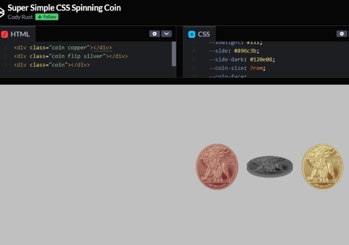
CSS/HTML-only spinning 3D coin. Note that the faces of the coins can be anything you want to be.
Made with: HTML and CSS
Author: Cody Rust
Compatible with: Chrome, Edge, Firefox, Opera, Safari
7. Bitcoin Pixel Art Animation CSS
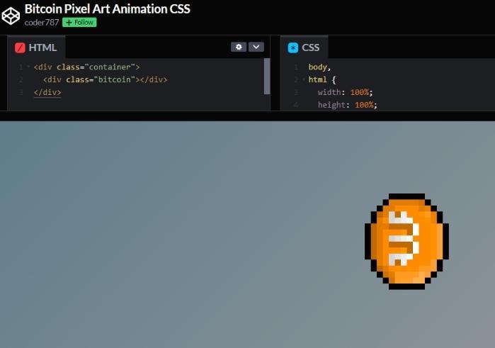
This is the pixelated art of the famous bitcoin.
Made with: HTML and CSS
Author: Coder787
Compatible with: Chrome, Edge, Firefox, Opera, Safari
8. Floating Dai Coin
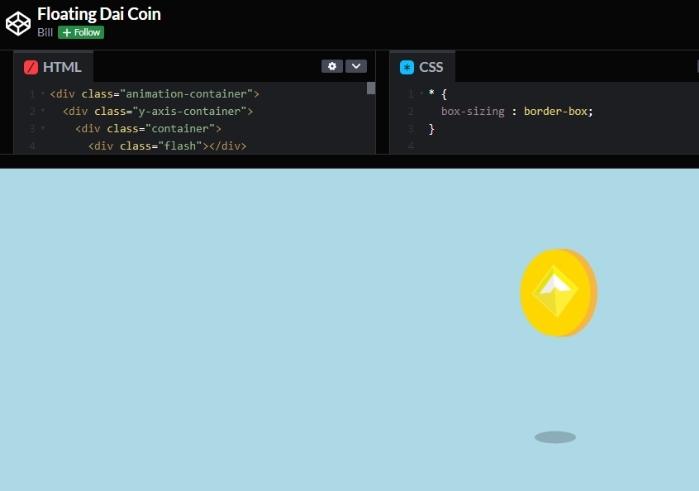
Made with: HTML and CSS
Author: Bill
Compatible with: Chrome, Edge, Firefox, Opera, Safari
9. G-Loot Spinning Rewards
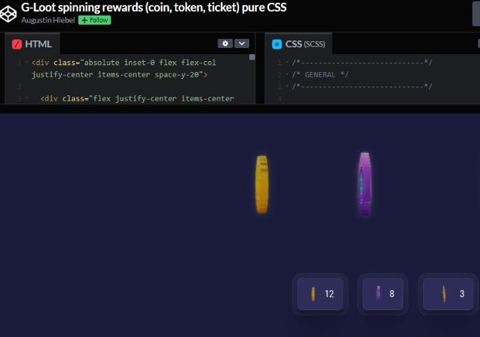
A CSS-generated spinning rewards coin for games
Made with: HTML and CSS
Author: Augustin Hiebel
Compatible with: Chrome, Edge, Firefox, Opera, Safari
10. Animated SVG Coin Drop with CSS
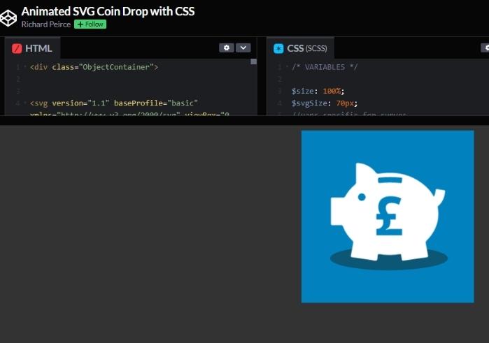
Made with: HTML and CSS
Author: Richard Peirce
Compatible with: Chrome, Edge, Firefox, Opera, Safari
11. JS Fiddle Falling Coins
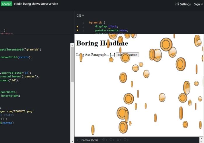
Made with: HTML, Javascript, and CSS
Author: JS Fiddle
Compatible with: Chrome, Edge, Firefox, Opera, Safari
12. Donate Button to Flip Coin Animation
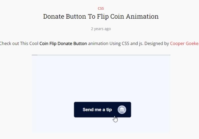
Made with : HTML, JavaScript and CSS
Author: Cooper Goeke
Compatible with: Chrome, Edge, Firefox, Opera, Safari
13. Coin Falling Animation
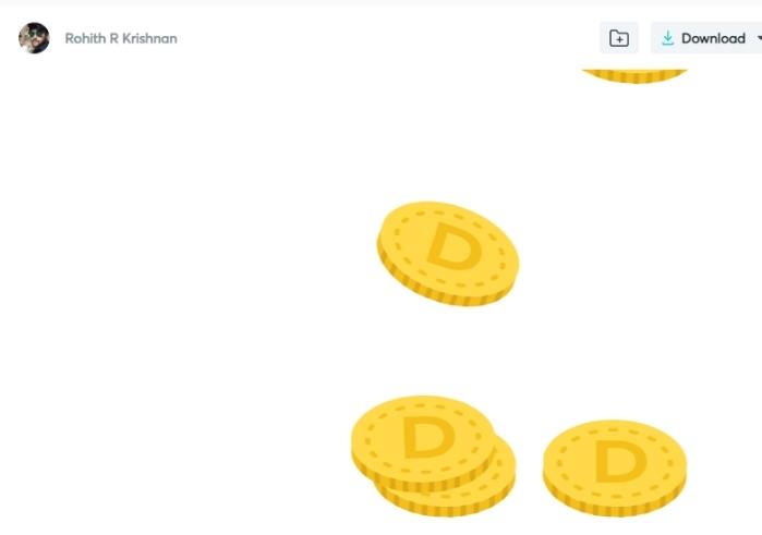
Made with : HTML, JavaScript and CSS
Author: Lottiesflies
Compatible with: Chrome, Edge, Firefox, Opera, Safari
Conclusion
Animations are a bit of a black box for many front-end developers. It would help if you were a CSS master or a skilled CodePen artist. Most to make great visual effects animations and special effects you see outdoors are made using simple techniques that require simple skills to execute! We hope this article is a guideline for your journey into the world of CSS coin animation.
