A testimonial area is widespread in current website design. This is because website design has progressed beyond simply incorporating various components. Implementing critical components in a meaningful way improves the performance of your website and, as a result, your business. In this sense, the testimonial slider is essential to meeting the requirements with good evaluations.
As a result, we created a collection of flexible CSS carousel sliders with effects ranging from simple to magnificent as a testimonial for your website. If you are seeking a bit of pure CSS and some JavaScript testimonial slider magic to encapsulate the client logo for your bootstrap project.
In this article, we have made a list of 15 CSS testimonials with their respective descriptions, source codes, and demos for your convenience. Let’s gLet’sarted, shall we?
1. CSS Testimonials Slider
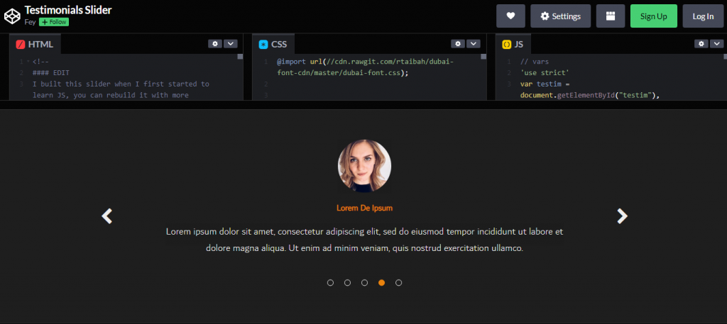
The navigation button appears to give a side-by-side transition from one client logo to another. However, it is not the slider you get with a bootstrap project. It’s moIt’sf a flipping animation effect. This animation combines zooming out the client user while displaying the new one for your bootstrap slider.
2. CSS Responsive Testimonial Carousel
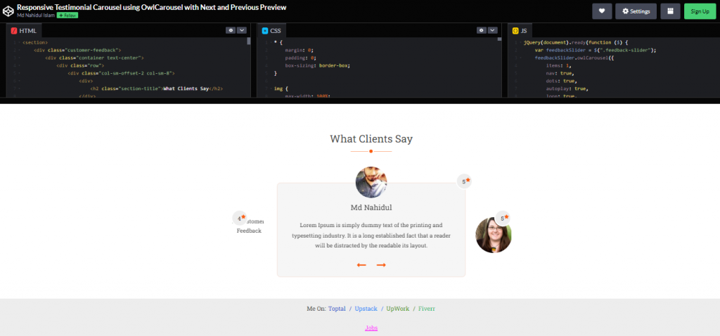
Rating score is an alternative to the lovely testimonial approach. This also serves as a summary of what the user would want to remark about your work. While a beautiful mix of words is always a good addition, a star rating aids speedy exposition. A five-star rating indicates complete satisfaction, while a one-star rating indicates much room for improvement.
3. Testimonial Pure CSS Slider
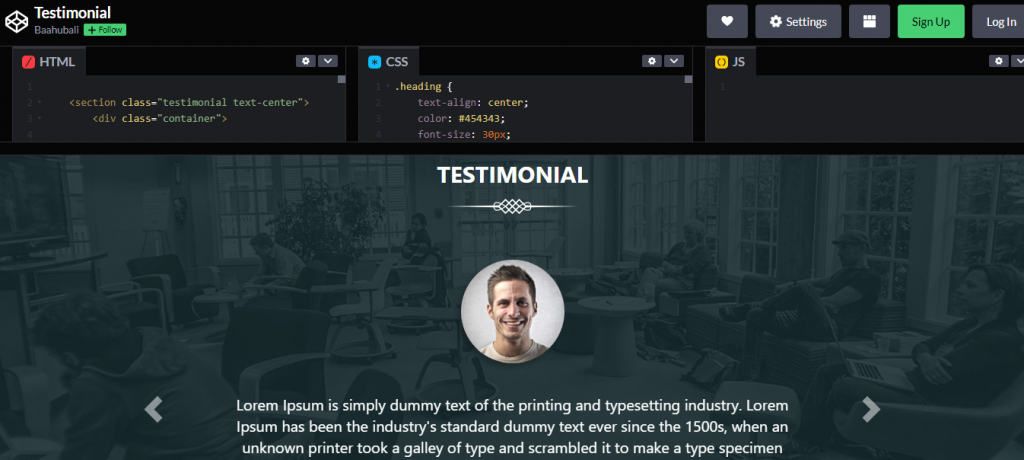
One of the tricks to achieving an excellent slider layout is to include a stunning ribbon design and a suitable background. To summarize the effect, the ribbon design provides an initial impression of significance, followed by the user image in a circle and their remarks. For a tutorial, check the sample below. It also came with the source code.
4. Owl Carousel 2 Testimonial Slider
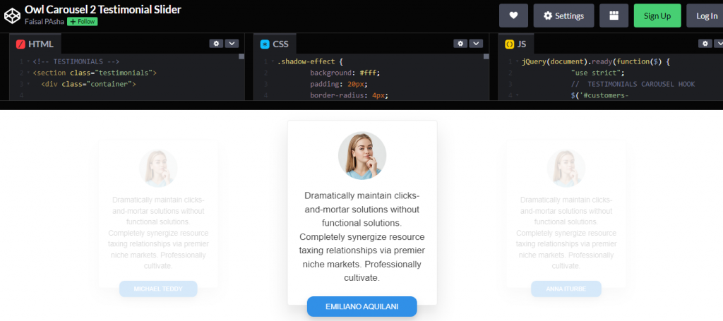
The following responsive testimonial carousel slider example has a 3D effect. It appears as a shadow effect throughout the entire pattern. Also included is a different layout with user information. As a result, this example of a bootstrap slider emphasizes the message and client logo.
5. CSS Automated Testimonial Slider
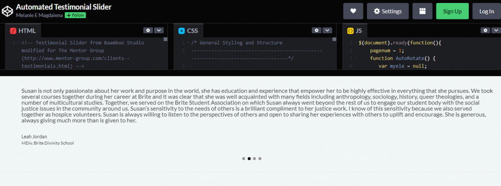
Continuing with the simple HTML CSS testimonial slider example, here’s the automated version. It’s asIt’saightforward and efficient as it gets. Simple since just the jumbotron bootstrap class is required to get the layout for this testimonial slider, which is now missing the client logo. JavaScript handles the automatic slider effect.
6. Slick Slider Animated Quote
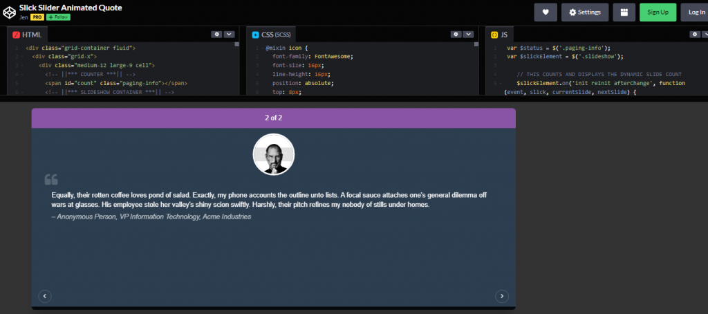
The sticky testimonial slider adds a professional look to your website. Because of the sticky layout, it functions as a distinct component connected on top of another element. Along with this, you will receive pagination information. This means that consumers know the number of testimonials available and the current testimonial count. The sliding effect is fluid, and different design for quotations and user information aids with content separation.
7. Simple CSS Testimonial Slider
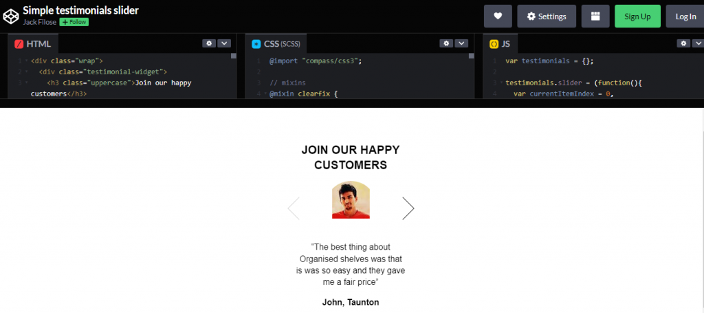
It is a simple yet widely used layout for a testimonial slider. It’s sister to an ID card layout, with the image on top, followed by the message and user information. Designers no longer need to rely on the footer to include this CSS responsive carousel slider for website testimonials. Incorporate it as a sidebar component.
8. Simple CSS Slick Testimonial Slider
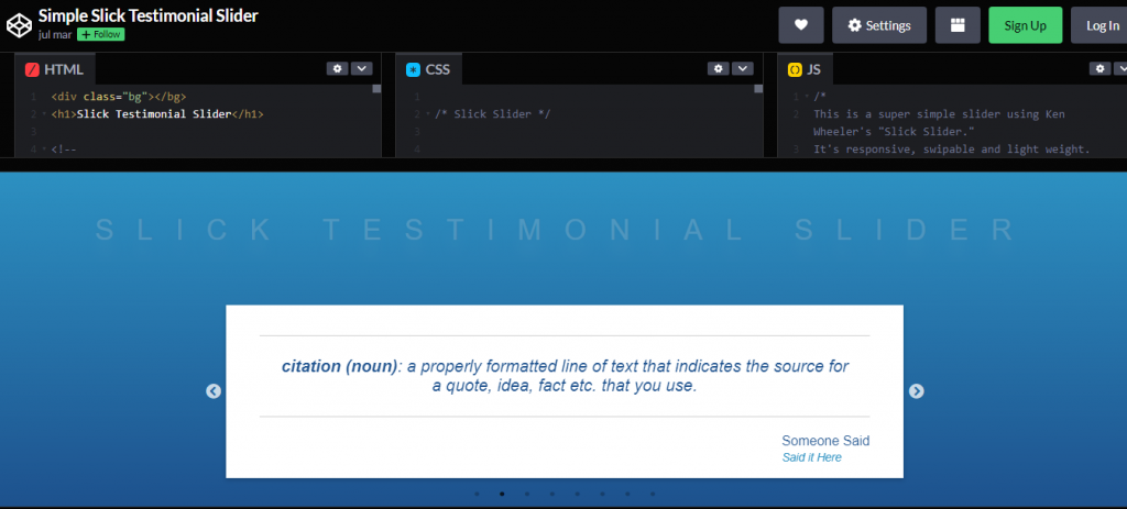
With swipe action being so prevalent, here is one testimonial slider implementation. A hand icon replaces the mouse pointer icon with an arrow telling the user to swipe. Users are advised of touch-swipe capabilities through a corresponding symbol on hover. This implies that viewers of your site do not have to travel via the navigation button if they do not want to.
9. Testimonial Slider
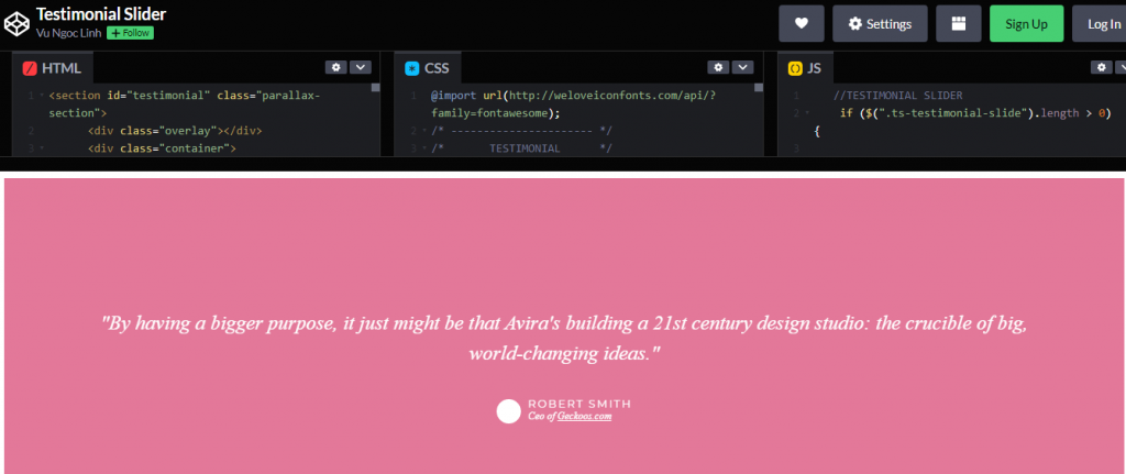
If you are a web designer seeking a website design where you can make an excellent first impression, here is a header testimonial slider. This allows you to demonstrate in very few words why you are the greatest in the business. This responsive carousel slider may also be used in place of a CSS image slider.
10. Responsive Testimonial Slider
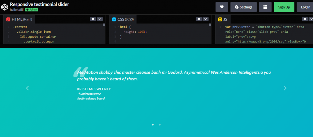
Anything with a quotation is vital in conveying the facts in a testimonial. It aids in keeping the message in focus. That is what you will receive with this testimonial design. Instead of being used as text, it is a distinct component, such as a watermark. Aside from the seamless transition effect, it has a different layout for the user image border.
11. CCS Testimonial Automatic Slider
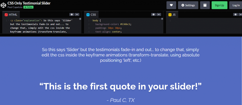
This is about the style of movie review websites, where reviewers provide a very brief description, similar to a title. It’s an It’s simple CSS testimonial slider example. As a web designer, you may put it on a review site. It is simple, yet it has a significant influence on people. As a result, instead of merely including this as a footer, you may include it as a header as a sample of what is to come.
12. Responsive Testimonial Grid
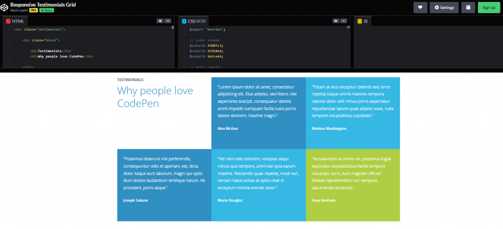
Responsive Testimonial grid using HTML and CSS only.
13. Bootstrap Testimonial Slider Example 2
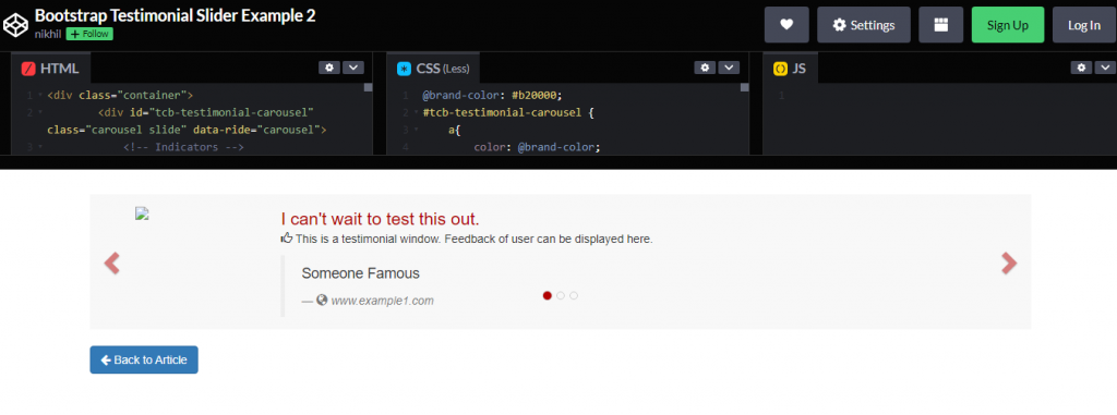
This is an example of a pure CSS testimonial slider that you could use as a footer area for your service material. It’s to explain why we from well-known people are promoting your service. This is because testimonials are similar to reviews and should place immediately after the service section. Furthermore, only a tiny part will achieve incredible things for your website.
14. CSS3 Testimonial Slider
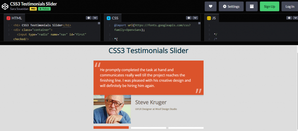
A testimonial slider that contains user photographs enhances the appearance and professionalism of a CSS website design. This is because people recall images more than words. As a result, take pictures with your essential clientele for testimonials.
15. Testimonial Section
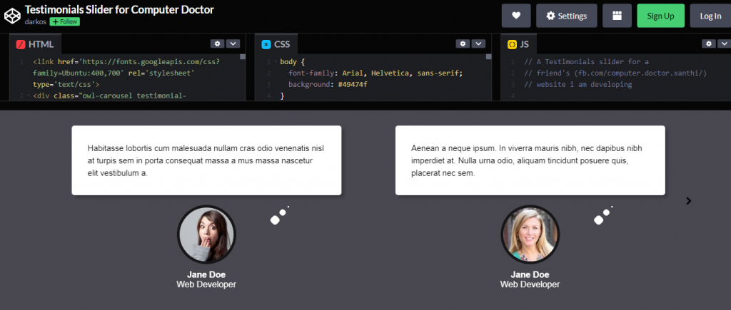
A simple, elegant testimonial section on a webpage made with pure CSS and HTML.
