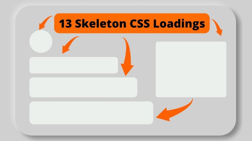
Any application relies heavily on motion. It may assist you in making interfaces more expressive and intuitive while also delivering crucial information, such as feedback that might direct a user’s attention to essential portions of your website.
Motion can also help improve perceived performance when it comes to loading animation. The action may make loading more performant by balancing speed, direction, and ease.
In today’s design trends, you need skeleton screens for your web pages as they are essential to visitor retention. They give the appearance of speed and manage visitors’ expectations by keeping them updated on the progress of a page’s content. One of the most important yet underappreciated benefits of skeleton screens is their assistance in avoiding Cumulative Layout Shift (CLS), which allows the material to show all at once rather than progressively as it loads.
How Does Skeleton Loading Work?
The animation is straightforward but powerful. A gradient from left to right should be animated. We also want to ensure that the angle goes over its container and disappears before beginning afresh.
When considering the motion, we should generally strive for 300–500ms. Anything less than this length causes animations to become too rapid to notice; anything more than this might appear slow, giving consumers the impression that they are waiting longer. It’s also worth noting that the slower the animation, the more complicated and huger it should be. More oversized items, like larger objects in the real world, travel slower.
How Does Skeleton Loading Improve Page Performance?
Skeleton loaders are an excellent example of apparent performance increase. A skeleton loader can serve as a placeholder for data that is still loading, allowing the user to concentrate on progress rather than wait times.
1. Skeleton Screen Gradient Animation
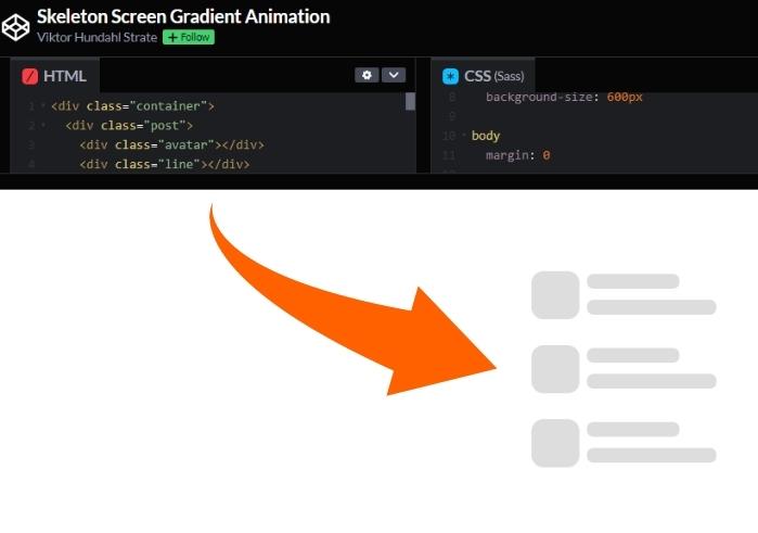
Download Source Code/ View Demo
Made with: HTML, CSS
Author: Viktor Hundashi
Compatibility: Chrome, Edge, Firefox, Opera, Safari
2. Card UI Skeleton Screen
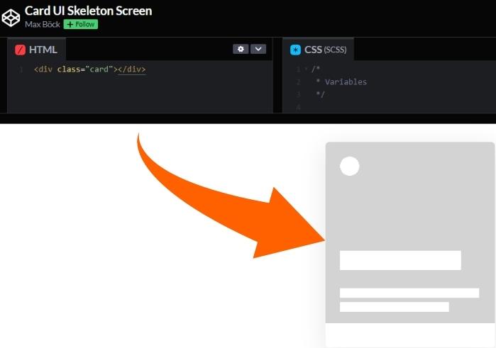
This generates a card component skeleton using CSS custom attributes to render multiple gradients on the background image. Skeleton displays can be utilized to increase perceived loading performance.
Download Source Code/ View Demo
Made with: HTML, CSS
Author: Max Bock
Compatibility: Chrome, Edge, Firefox, Opera, Safari
3. Card Skeleton Loader
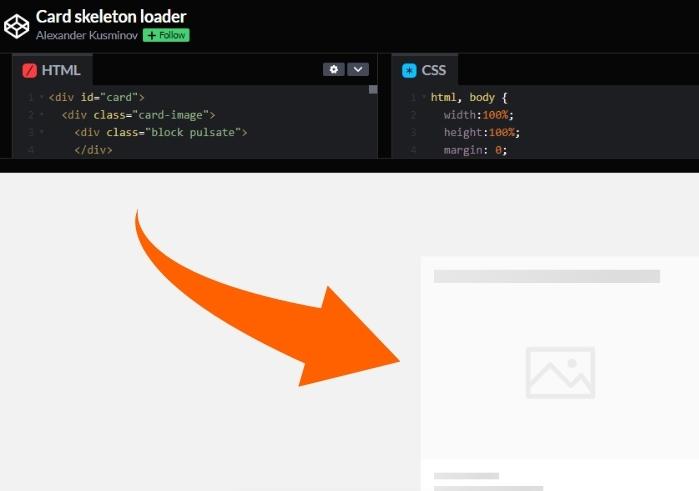
Download Source Code/ View Demo
Made with: HTML, CSS
Author: Alexander Kusminov
Compatibility: Chrome, Edge, Firefox, Opera, Safari
4. CSS Grid Card Skeleton Screen with Custom Props
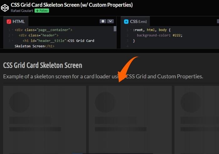
The skeleton page is a popular trend in the UX sector. When the page layout is created with CSS Grid, it is more feasible to deal with dynamically repeated components.
Download Source Code/ View Demo
Made with: HTML, CSS
Author: Rafael Goulart
Compatibility: Chrome, Edge, Firefox, Opera, Safari
5. Pure CSS Skeleton Loading Animation with Shimmer
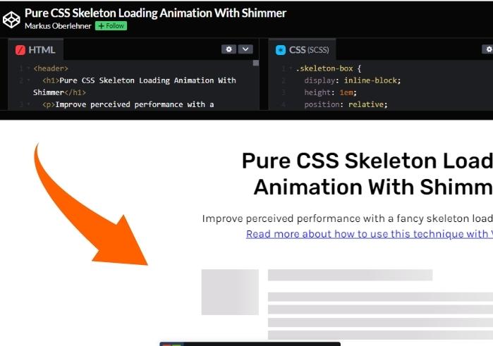
Download Source Code/ View Demo
Made with: HTML, CSS
Author: Markus Oberlehner
Compatibility: Chrome, Edge, Firefox, Opera, Safari
6. CSS Skeleton Loader Animation
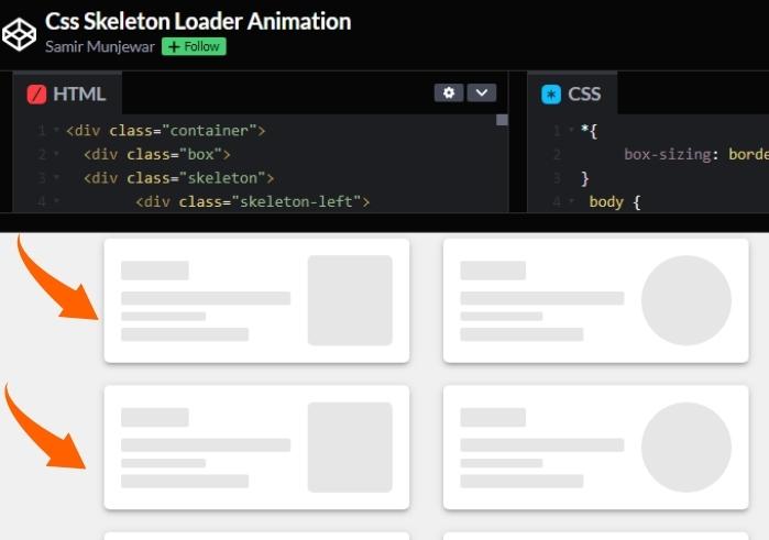
Download Source Code/ View Demo
Made with: HTML, CSS
Author: Samir Munjewar
Compatibility: Chrome, Edge, Firefox, Opera, Safari
7. Movies Skeleton Loading
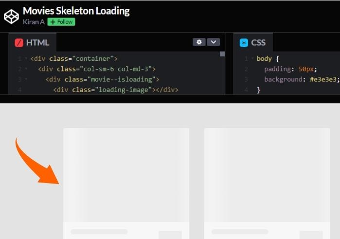
Download Source Code/ View Demo
Made with: HTML, CSS
Author: Kiran A
Compatibility: Chrome, Edge, Firefox, Opera, Safari
8. Skeleton Loading
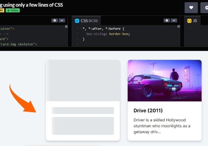
Download Source Code/ View Demo
Made with: HTML, CSS
Author: Havard Brynjulfsen
Compatibility: Chrome, Edge, Firefox, Opera, Safari
9. CSS Skeleton
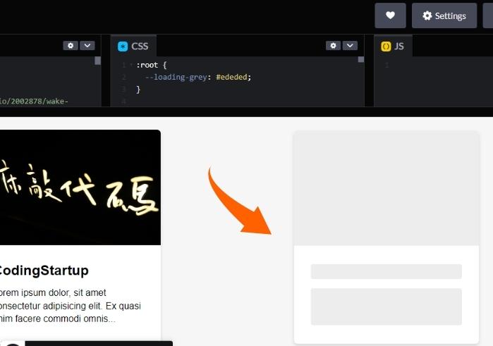
Download Source Code/ View Demo
Made with: HTML, CSS
Author: Steven Lei
Compatibility: Chrome, Edge, Firefox, Opera, Safari
10. Loading Card
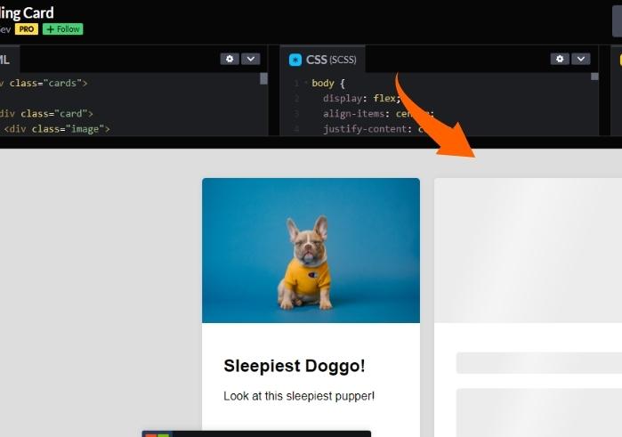
Download Source Code/ View Demo
Made with: HTML, CSS
Author: Chris Sev
Compatibility: Chrome, Edge, Firefox, Opera, Safari
11. Testing skeleton CSS loading
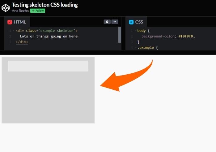
Download Source Code/ View Demo
Made with: HTML, CSS
Author: Ana Rocha
Compatibility: Chrome, Edge, Firefox, Opera, Safari
12. Slick Slider & Skeleton CSS
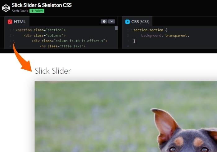
Download Source Code/ View Demo
Made with: HTML, CSS, JS
Author: Ana Rocha
Compatibility: Chrome, Edge, Firefox, Opera, Safari
13. Simple Skeleton Contact Form
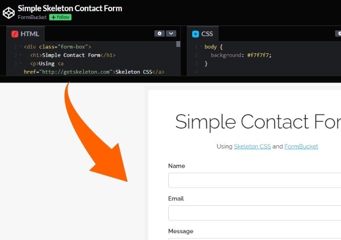
Download Source Code/ View Demo
Made with: HTML, CSS
Author: FormBucket
Compatibility: Chrome, Edge, Firefox, Opera, Safari
Conclusion
When dealing with minor animations, it’s clear that implementing them shouldn’t be difficult. Nonetheless, the user experience they give surpasses the time and work required to create them. If you convert the gradient’s fixed width to a %, you’ll be able to reuse the animation in numerous shapes and sizes. It would help if you composed it once and then utilized it as needed.
