There are thousands of different fonts, easily available with two or three mouse clicks. However, it’s harder than ever to know if a particular font fits your business or design. In this article, we’ll help you make the right choice by taking a closer look at the different types of fonts and their associated designs.
The typographic family of linear (according to the Vox-Atypi classification), or “grotesque” according to German terminology, is characterized by the absence of serif (“sans serif” font). It developed after the First World War in the trivialization of advertising prints (posters, catalogs). Bauhaus research in the early 1920s, the works of the Bauhaus artists, ban all aestheticism and tend towards functionalism, mixing architecture and typography that they treated in the same way, adopting models that seemed to them devoid of cultural characteristics.
What are Grotesque fonts?
Source – https://creativemarket.com/
Called Grotesques in Europe and Gothic in America, they originate from the 19th century. These are the first sans serif versions derived from an Egyptian type, but the series has been removed in this case.
Called by the English and Americans, San Serif, indicating that the canes have no florets, and cited in Spain as Sans Serif letters. The Grotesques form a very large family of types, within which the variants multiply: round, italic, wide, narrow, fine, semi-black, super black. This great variety of shapes being precisely one of the main grotesque current characteristics.
And now, let us reach the 31 best Grotesque fonts that you should know.
Let’s start!
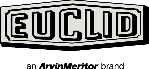
1. Euclid – Grotesque Fonts
Source: https://all-free-download.com/
License: Free for commercial use
Known to be the “ultimate geometric” font, it is no coincidence that the font created by the famous designer Alvin Lustig is at the top of the rankings.
Built from foundation forms, including mono columns, Euclid is practical, exceedingly moderate, and elegant. The ideal font to make the work of a graphic designer speak!
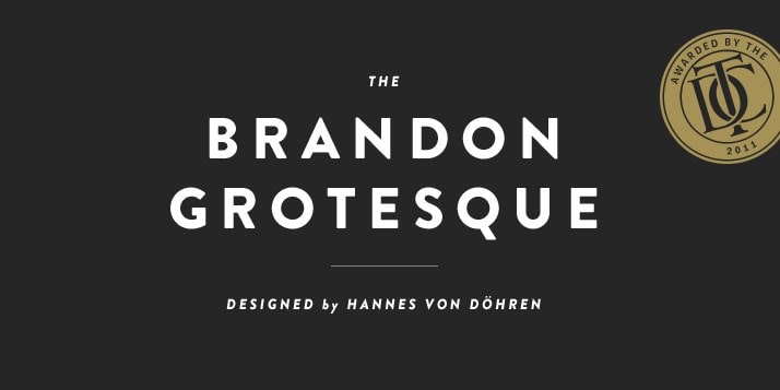
2. Brandon Grotesque
Source: https://fontsfree.pro/
License: Free for personal and commercial use
Less ascetic than Euclid and geometric and sans-serif, Brandon Grotesque exudes a warmth that approaches humanity. Typographer Hannes von Döhren designed it based on handwritten advertisements in the 19th century but maintaining sharp angles to increase readability. We can say that Brandon’s grotesque is an everyday font; if you are the type of person who likes simplicity well, Brandon’s grotesque is the perfect choice for you.
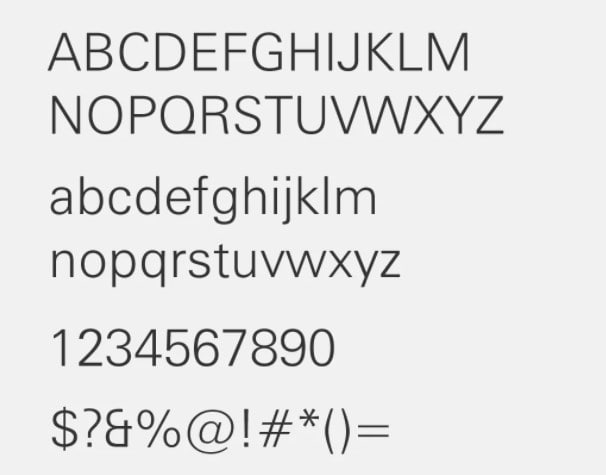
3. GT Haptik
Source: https://www.grillitype.com
License: Free for commercial use
This monolinear, designed by Reto Moser and Tobias Rechsteiner, has an interesting little twist: capital characters are projected to be touched blindly. “Form succeeds touch,” proclaim the creators of GT Haptik font.
The capital characters of GT Haptik were improved to be understandable, and this offers the letterforms an unusual garde chape.
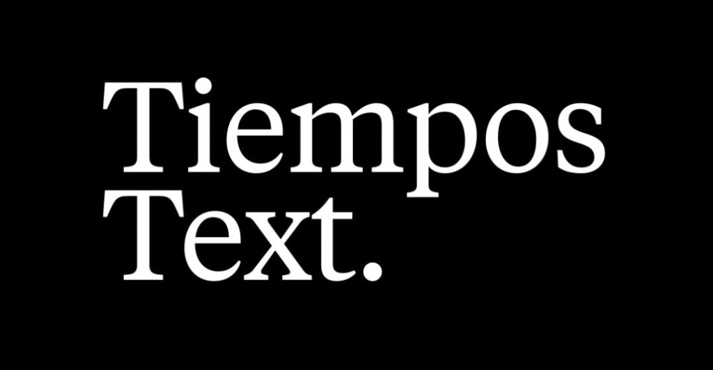
4. Tiempos
Source: https://fontsup.com/font/tiempo.html
License: Free for personal and commercial use
Tiempos was initially a variant of the Copernicus Galaxy font created for the overhaul of a Spanish daily. It is now a full-fledged typeface, perfect for body text, and National Geographic uses it for designing their magazine. The good thing about Tiempos is that this font can make your project look very organized and classified.
5. Konop
Source: https://www.whatfontis.com/
License: Free for commercial and personal use
This typeface is a font that you don’t see every day: gothic, fixed size, and square. Created by Mark Simonson, Konop is reminiscent of Gothic wood fonts in addition to geometric. I’ll call you a genius if you use this font for creating your own project’s logo; this font is rare because of its uniqueness.
Use it and get a special logo!
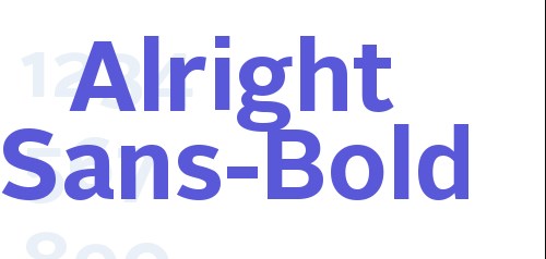
6. Alright Sans
Source: https://fontsfree.net/
License: Free for commercial use
Another modern and unpretentious font, Alright Sans, balances the austere and the earnest. With its open construction and shorter but wider caps, the many-sided font looks just as good in small and also in a large size.
Alright Sans is a beautiful, lucid, pure font, alright sans, despite its simplicity, make your Text looks fancy.
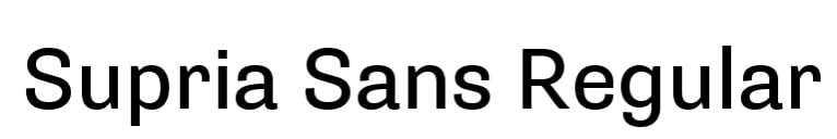
7. Supria Sans
Source: https://www.fontsmarket.com/
License: Free for commercial use
Another good shot from Hannes von Döhren! Supria Sans combines the sharpness of Swiss typographic design with arcs and obvious details that give it an enthusiastic look. The font family also includes an italic calligraphic style.
Supria Sans has the same font characters written at the top, but this one looks like it has an area of bold writing, and it still a cool font at the end.
8. Burgess
Source: https://www.onlinewebfonts.com/
License: Free for personal and commercial use
While it is generally believed that TIMES NEW ROMAN was drawn for the British newspaper in 1931 by Lardent VICTOR and Stanley Morison, some typography historians claim that the typeface was indeed based on the work of American industrial designer William Starling Burgess in 1904.
For its 50th anniversary, the British foundry Colophon worked for five years on the Burgess font using excerpts from old photocopies featuring letters from Time New Roman Bold and Bold Italic.
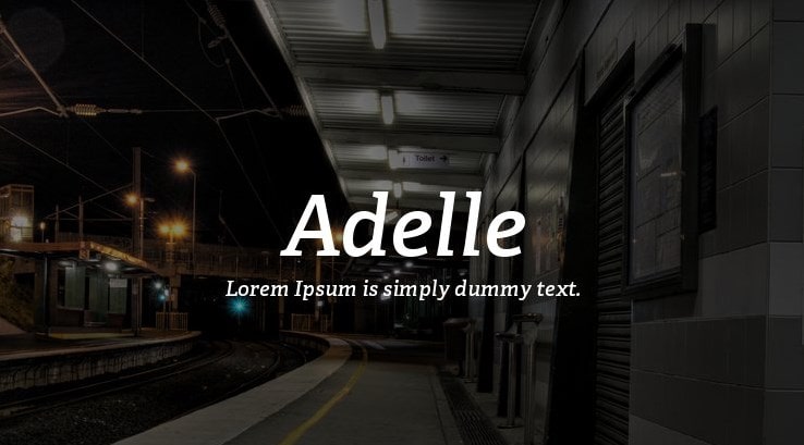
9. Adelle
Source: https://www.azfonts.net/
License: Free for commercial use
Adelle was created for newspapers and magazines, but the font is variable enough to be used everywhere, especially on the web. It works great in blocks of continuous Text, even on the most ruthless of media.
Adelle is such a beautiful font specially deliberated for article use in journals and booklets.
10. Cooper Black
Source: https://fontsgeek.com/
License: Free for commercial use
We already know the classic Cooper, designed by Oswald Bruce Cooper and launched in 1922. The digital character foundry Bitstream has made a complete series of letters with rounded contours, the popularity of which is still unabated in 2019.
11. Graphik
Source: https://www.dafont.com/
License: Paid for commercial use
Graphik was designed in 2009 by Christian Schwartz, who took inspiration from modernist design to come up with an incredibly versatile font in communication. Whether in the foreground or in a supporting role, you can trust it with publishing, branding, video, web, apps, and more.
12. GT Super
Source: https://www.grillitype.com/
License: Free for commercial use
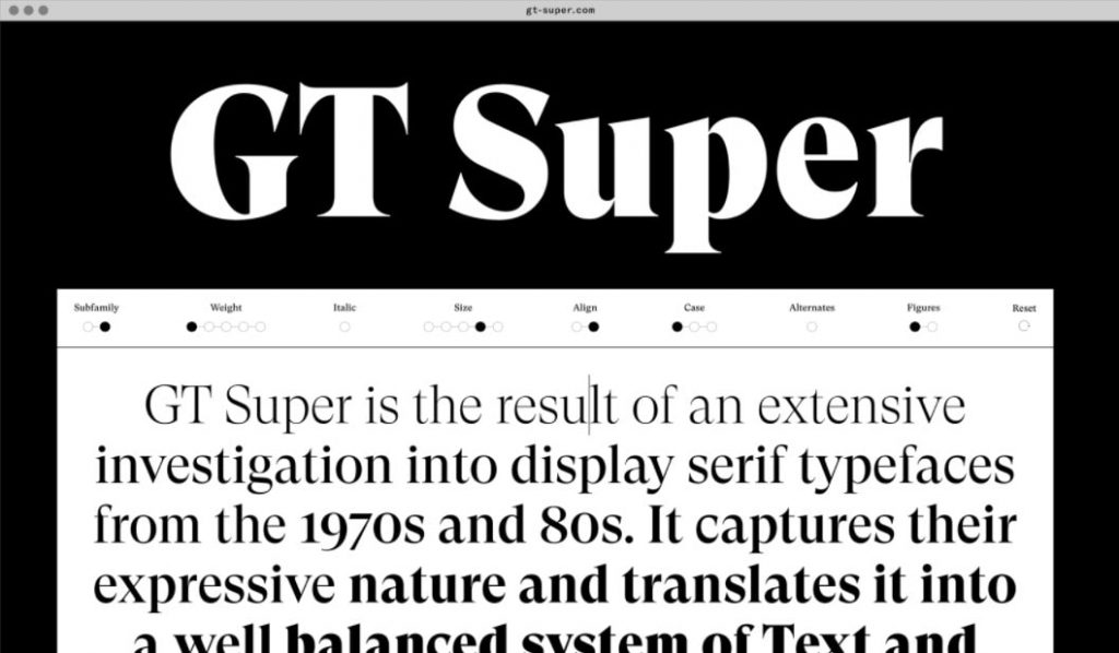
Launched last year, GT Super is inspired by display lettering from the 1970s and 1980s (Trooper Roman, for example) to provide a singular and expressive tone while maintaining consistent shapes for shock effect.
One look at the new GT Super, and you’ll realize this is no ordinary typeface. When you consider what it comes with, you’ll be surprised at what it goes.
13. Cotoris
Source: https://dafonttop.com/cotoris.font
License : Paid for commercial use
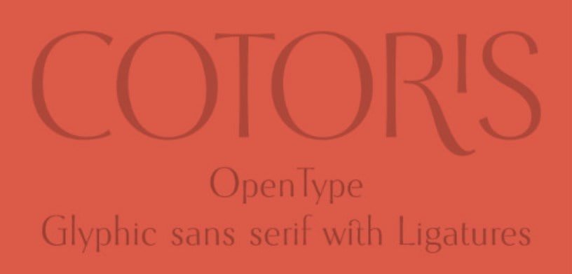
Cotoris is a pretty icon sans-serif font that involves manacles and small caps. This font is especially useful when searching for a stylish design or a girlish touch. A brilliant, inspired & highly desired-the typeface you’ve been waiting for, wherever you use Cotoris, you’re with a style of your own.
14. Self Modern
Source: https://fontsgeek.com/fonts/self-modern
License: Free for commercial use
French typographer Lucas Le Bihan is known for his monkish work, which results in breathtakingly beautiful fonts. Its Self Modern, launched in 2016, is no exception. In Text, italics, and bold, the font was made in Lucas Le Bihan’s foundry in Brittany, a foundry aptly named Bretagne.
15. GT America
Source: https://fontsarena.com/
License: Free for commercial use
Developed by Seb McLauchlan, GT America tide over in the middle of 19th century American Grotesque fonts and neo-grotesque -20th century Europeans. GT America keeps the best graphics in all of them, and it’s available in 84 styles.
Style isn’t something you can practice. It’s something you’re born with, Like GT America. Very long, very thin, very elegant.
16. Univers
Source: https://www.downloadfonts.io/
License: Paid for commercial use
More than 60 years after its creation, the neo-grotesque Univers sans-serif font still retains all its attractions for graphic designers. This font is proof of its creator Adrian Frutiger’s thoroughness, who ensured that each version of the Univers’s letters is mixed within the same word without affecting its visual consistency.
17. Pitch
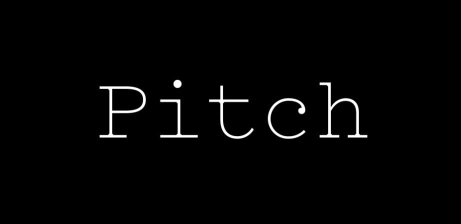
Source: https://www.onlinewebfonts.com/
License: Free for commercial use
Here is a perfect blending of the graphic designer’s search for beauty and the typographers’ desire for efficiency.
Romantic, serious, literary, and minivan, Pitch is nothing less than a love letter to the typewriter, still adored by the younger generations for whom it represents a passage to the past.
18. Akkurat
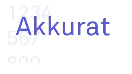
Source: https://fontsfree.net/
License: Free for commercial use
Designed by Laurenz Brunner, Akkurat fonts have long been famous for print designers. It’s recently regained its glory thanks to the web. Also, it’s no surprise, this brilliant reworking of a 19th-century typeface remains readable in all formats.
This font is fun and useful simultaneously; you will never feel bored of using it.
19. Colfax
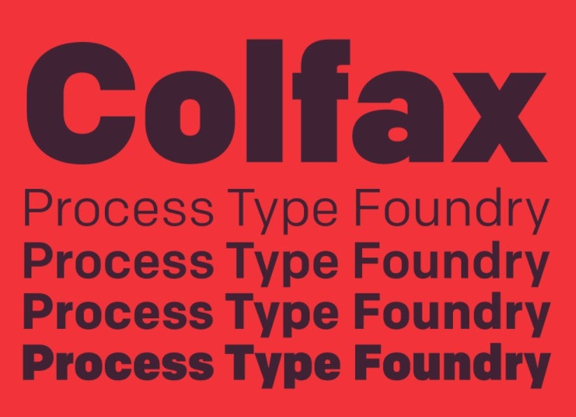
Source: https://fontstand.com/fonts/colfax2
License: Paid for commercial use
From the family of sans-serif fonts based upon the abstraction of ‘suggested geometry,’ Colfax displays almost perfect circles.
Named after a boulevard in Minneapolis, the hometown of designer Eric Olson, Colfax works very well in the workplace, with its stylized yet pragmatic side.
20. Konop
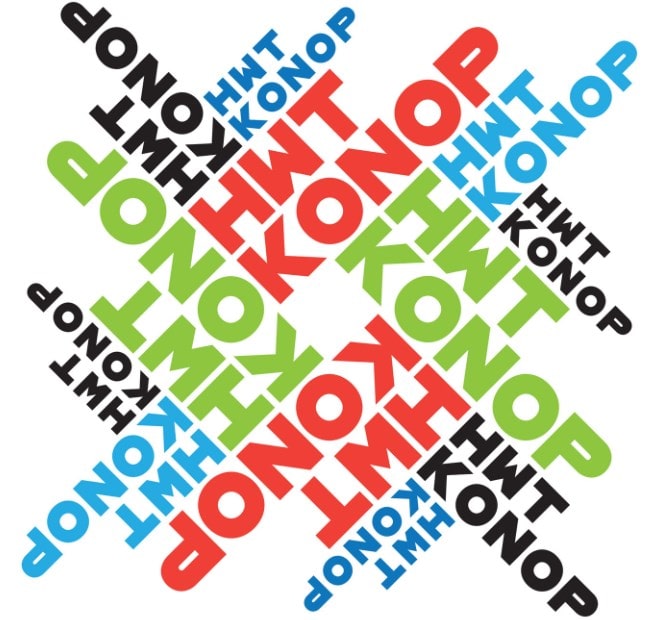
Source : https://www.whatfontis.com/
License: Free for commercial use
It is rare for a Gothic font to display such a square shape. Conceived by Mark Simonson, Konop displays a different and attractive style, with characters aligned, regardless of the font size. The characters of this font can be arranged horizontally or vertically in any orientation you like.
21. Regime Grotesk Font
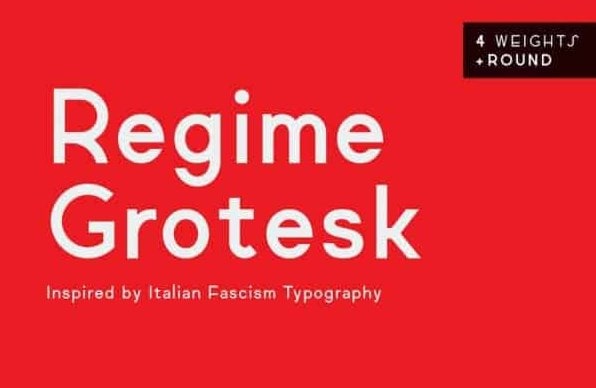
Source: https://allbestfonts.com/
License: Free for commercial use
Stimulated by an Italian graphic design of the 20s and 30s. The fascist regime font did an excellent job of hype by selecting some Police like Futura. Diet inherits these proportions, with whippletree and the particular leaning. It is created to be stabilized, contemporary, and easily adaptable to the web and print.
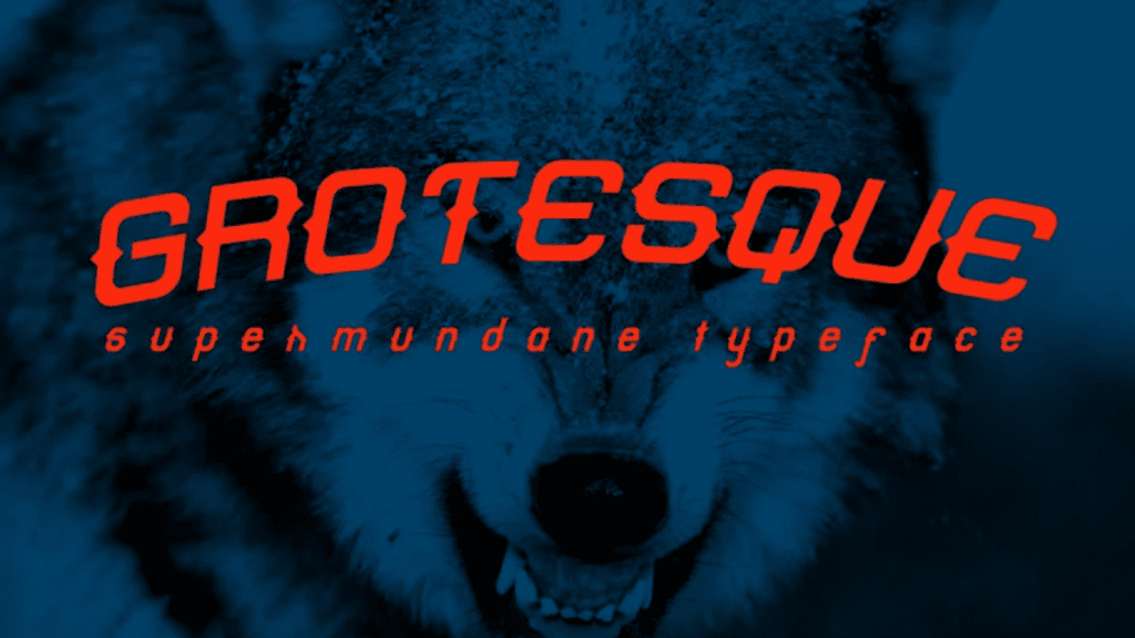
22. Grotesque Supermundane
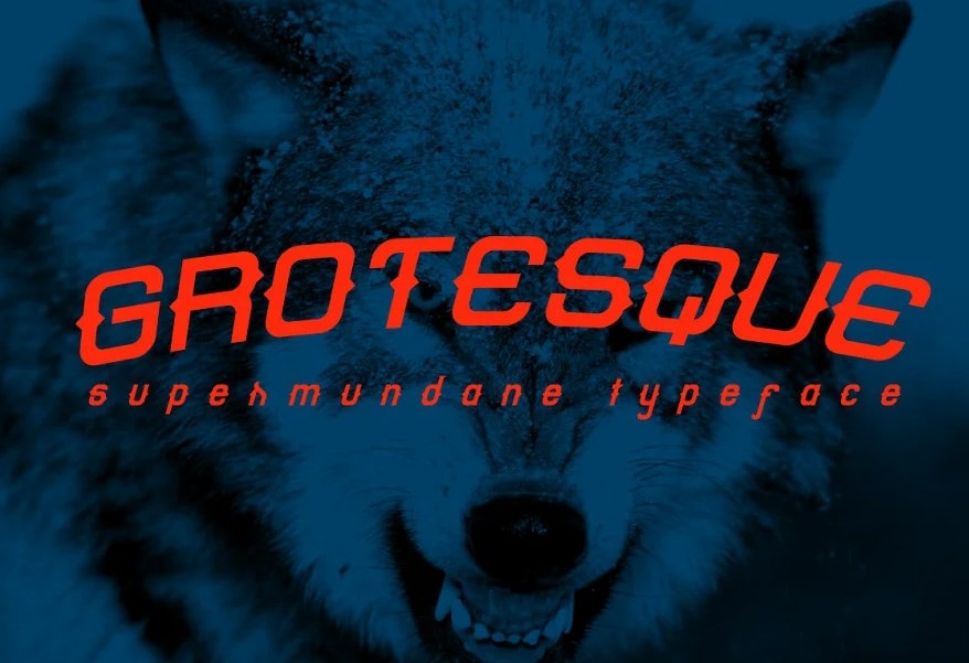
Source: https://creativemarket.com/
License: Paid for commercial use
Grotesque Supermundane Font a handmade font with a unique style; this handwriting font would be great for your design projects. It can be suitable for quotes, t-shirts, posters, logos, or anything. Grotesque supermundane is one the best fonts that I wonder you to choose if you are searching for an incredible design for logos.
23. Gorga grotesque
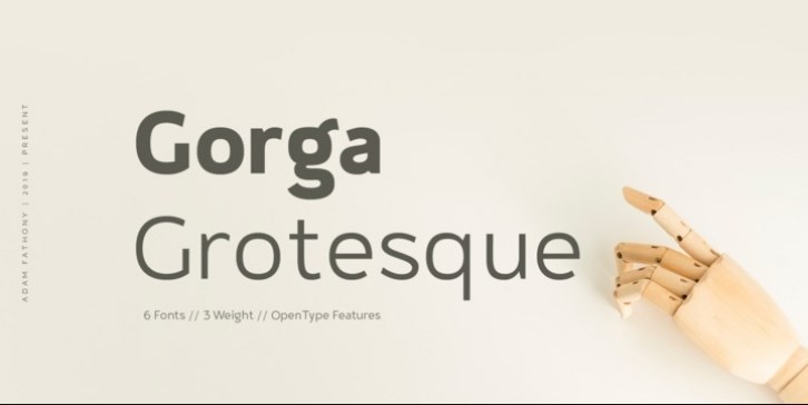
Source: https://www.smashingfonts.com/
License: Free for commercial use
Gorga is known as a classic font to go with a grotesque twist. Besides, of six typefaces with three dissimilar heaviness & the corresponding italic version of these Fonts. STIMULATED by a Geometric typeface and also Humanist Without These Fonts are the most used; work on them for better readability.
24. Construction grosteque
Source : https://www.1001fonts.com/
License: Free for commercial use
Construction Grotesk is a sans serif font with utmost boldness; even so, unmoving owns a strong disparity. This typeface is so exclusive, as it has various characters to go with a structure ready to be used and other icons on numbers and punctuation.
25. Sentral
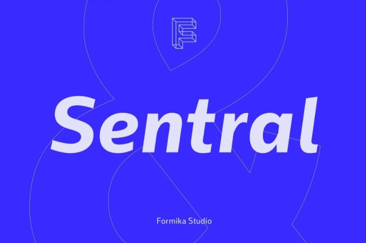
Source: https://allbestfonts.com/sentral/
License: Free for commercial use
Sentral is based on the traditional traits of Sans-Serif’s grotesque, contemporary typography for today’s needs. Operated with some geometric form, angular feel with scalable feature explained in visual language. The transformation and flexibility of modern expression have been combined to create the main ideas persona, feeling friendly, warm, and energetic.
26. Vaska
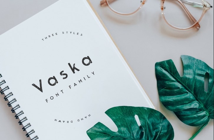
Source: https://fonts.do/
License: Free for commercial use
VASKA is a grotesque handwriting font. Greatest combined with other handwriting components, understated plot, moreover, it can isolate as title or body text. Vaska! Costs nothing to buy. Costs little down the road.
27. Etheline
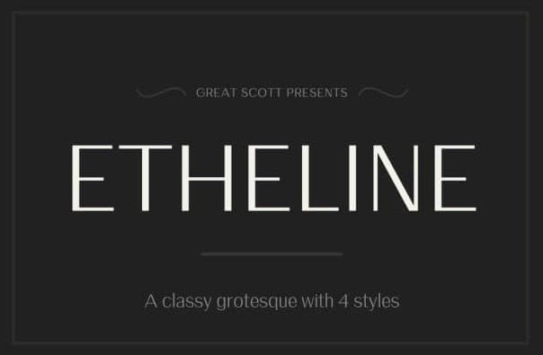
Source: https://allbestfonts.com/etheline/
License: Free for commercial use
Etheline is a modern grotesque with a little bit of contrast and a preferably high X-height. Etheline will give your
birthday/ WEDDING INVITATIONS, Logos, Quotes, etc., a shiny and elegant look.
More what? More of a typeface. That’s what! Do something good for your design.
28. Brown
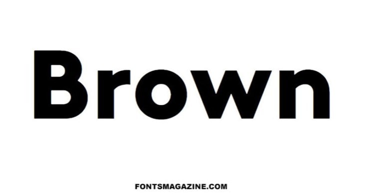
Source: https://thefontsmagazine.com/
License: Free for commercial use
THE BROWN, a fancy and modern nostalgic style display font, we have managed to give you facility and simplicity in achieving typographic jobs such as title, T-shirt and logotypes, and other creative projects.
29. Catesque
Source: https://fontsfree.net/
License: Free for commercial use
Catesque can make a distinction, especially for broad-size projects in addition to short texts. The adaptability features in catesque are useful for many design applications; cotesque goes with different mass from light to black.
Every Catesque dispositions combined laminated figures, parts, and other most common digital features like super & index to accomplish digital design tasks like menu, reports etc
30. Sprout
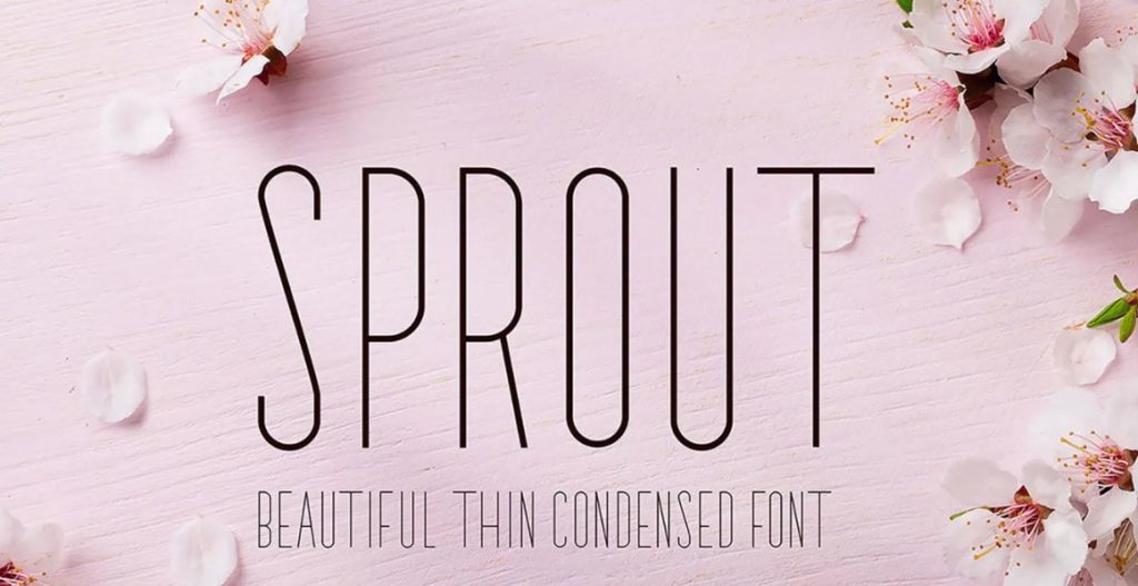
Source: https://www.freeforfonts.com/
License: free commercial use
Sprout is known as an attractive & stylish precipitated fine (sans serif) font. Sprout is ideal for creating every wedding design. Additionally, the sprout is flawless for that soft, cute & adorable look you want in your website, wedding albums, invitations, motivation letters, etc.
31. Helvetica
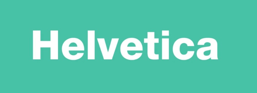
Source: https://freefontsfamily.com/
License: Free for commercial use
Many ignore the fact that not only was Universe famous before Helvetica but also that it inspired Max Miedinger to create the latter. Both fonts enjoyed similar glory until the 19th century when” Adobe, and Apple, and Xerox” adopted Helvetica as a sole of the primary typefaces
in the (PostScript) description system.
Helvetica has since become famous worldwide, as can be seen in the many examples above. It is indeed a simple and efficient font, which nevertheless retains some original touches, such as the narrowness of the “t” and “f” or the triangular upper serif of the “1”.
One of the most fundamental aspects of a successful job for a graphic designer is blending beautiful and unique fonts. This compounding is often what the public will see first.
The Grotesque fonts are stylish with amazing and unique designs. Choose any of the above to sensationalize your design.