Many people don’t enjoy the visual disturbance of subtitles. And this makes sense: most subtitles you see are small, plain gray & white in a boring, simple font. The subtitles you see don’t often add much visual character to the video they transcribe.
That’s why it’s a great idea to customize your subtitles with the exact font, color, size, position, and style you want. Your captions shouldn’t distract from your video but enhance it.
Your subtitles need to be readable and perfectly synced with the video and ideally follow the reading skills of your audience. When choosing the right font for your subtitles, you must think wisely about what to choose. Your subtitles should be so easy to read that your viewers should even forget that they’re watching videos with subtitles on.
Clear and readable text indications that are pleasing and comfortable to the eye help make your content more accessible and engaging. When you set up a font for your subtitles, make sure to use a readable and light font. You don’t want to cover up your videos with a font too creative.
While fonts need to look good, it’s also vital that they’re readable. Often, we like a font because it’s readable, not just because it looks nice – try to pick a font that not only represents your brand values but is also enjoyable to read.
Below is the list that contains the best fonts for subtitles that enhance their readability. I have listed the best after thorough research and inquiries from the best in the field that you can use on YouTube, Movies, or any video.
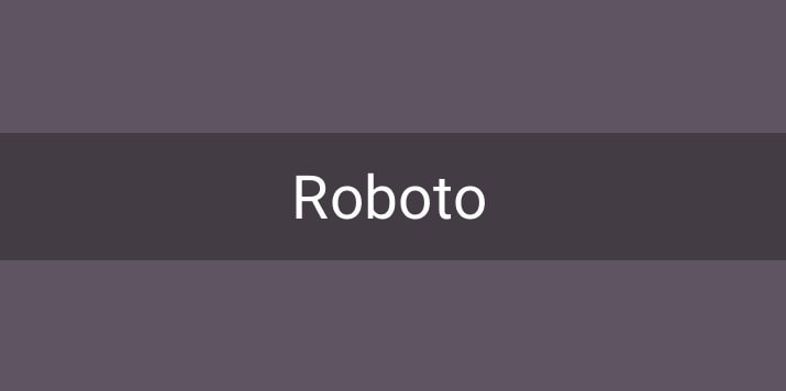
1. Roboto – Subtitle Fonts
Source: https://fonts.google.com/
License: Free for commercial use
Roboto has a mechanical skeleton, and the forms are essentially geometric. It features friendly and open curves and doesn’t compromise, allowing letters to be settled into their natural width. Roboto has a wide range of weight and styles, but subtitles and captions avoid condensed or super-thick or thin consequences.
You might recognize Roboto Medium as the font YouTube uses for subtitles by default. Its use is pretty universally across device types, screen sizes, and for several purposes. Subtitles and captions are an exception, and it is the default font on Android and most Google services.
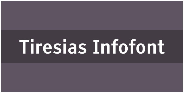
2.Tiresias Infofont
Source: https://www.fontssquirrel.com/
License: Free for commercial use
You must have seen the BBC use this font for subtitles. It is created by The Royal National Institute for the Blind for people with impaired vision. It includes two typeface options- the free Infofont and premium Screenfont, which has more prominent spaces and dashes, explicitly made for TV.
It is a bright and clean font that can improve the reading quality for anyone viewing video or film content. It will enhance your discussion and conference videos very well.
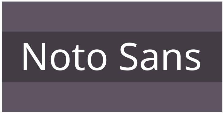
3.Noto Sans
Source: https://fonts.google.com/
License: Free for commercial use
This font is my favorite one from the list, and it’s because it supports lots of writing systems and languages. It is created through collaboration between Google and Monotype and gives simplicity, clarity, and elegance to subtitles. Noto Sabs evoke warmth and personality as they tend to look like they are done by a human hand. Additional features would be: supports symbols, emojis, and looks very clean and crisp on TV.
4.Source Sans Pro
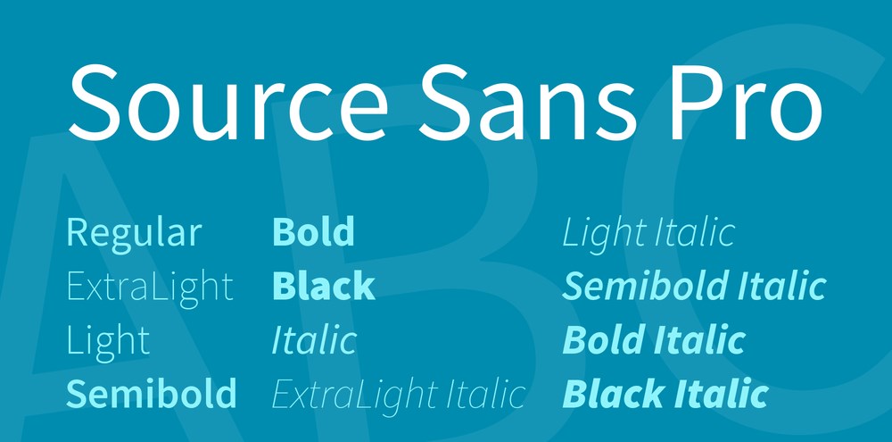
Source: https://fonts.google.com/
License: Free for commercial use
Source Sans Pro is created by Paul D.Hunt and released by Adobe in 2012. It has a modern typeface and decorative fonts, and it has full language support for many languages and is available in six weights. It is stylish, versatile, and best for body text.
5.Arvo

Source: https://fonts.google.com/
License: Free for commercial use
Arvo is a geometric slab-serif typeface family suited for screen and print. It is a libre font, first published in Google Fonts, and is mono linear-ish but has a little contrast, increasing its legibility.
6.Allerta Stencil

Source: https://www.google.com/fonts/
License: Free for commercial use
Allerta was initially developed for use in signage. It is designed to be easily and quickly read, and work well as subtitles over dynamic content, and allows you to communicate most effectively with your audience. Each glyph exploits the unique aspects of the individual letters to be easily distinguished from any other.
7.Oleo Script
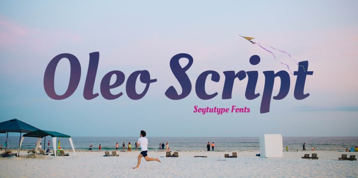
Source: https://fonts.google.com/
License: Free for commercial use
Oleo is a flowy yet legible non-connected script typeface. It is perfect for situations where a quaint and casual lettering effect is desired. Suitable for various typography contexts, including captions, headlines, packaging, invitations, cards, posters, advertising, greeting cards, and book jackets.
8.Bevan
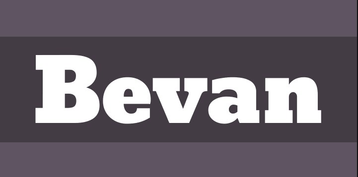
Source: https://fonts.google.com/
License: Free for commercial use
Bevan is a reworking of a traditional slab serif display typeface created by Heinrich Jost in the 1930s. In Bevan, Jost’s earlier letterforms have been digitized and then reshaped for use on the web, such as opening up the counter forms a little and optimizing the stems for use in bold display typography in modern web browsers. You can use this font for promotional offers in your video.
9.Paytone One
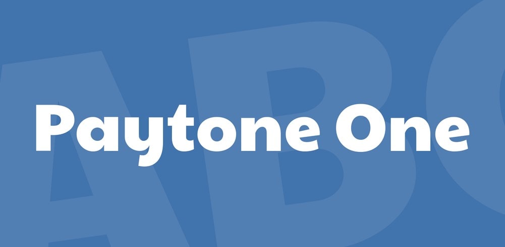
Source: https://fonts.google.com/specimen/Paytone+One
License: Free for commercial use
Paytone One is a sans serif typeface developed for use as a display and headlining Webfont on modern web pages. The face has a slight casual appearance with big round bowls. The diagonal stroke terminals add some visual play to the overall appearance of the font.
10.Khand

Source: https://fonts.google.com/
License: Free for commercial use
Khand is a family of compact mono-linear fonts with very open counter forms. The family is developed for display typography and is primarily intended for headline usage. Its letterforms are dynamic, and everything is designed according to a modular system.
This typeface strikes a good balancing act and avoids too much repetitiveness. The lighter styles are suitable for short paragraphs of running text, while the heavier styles have been optimized for headlines or single word settings.
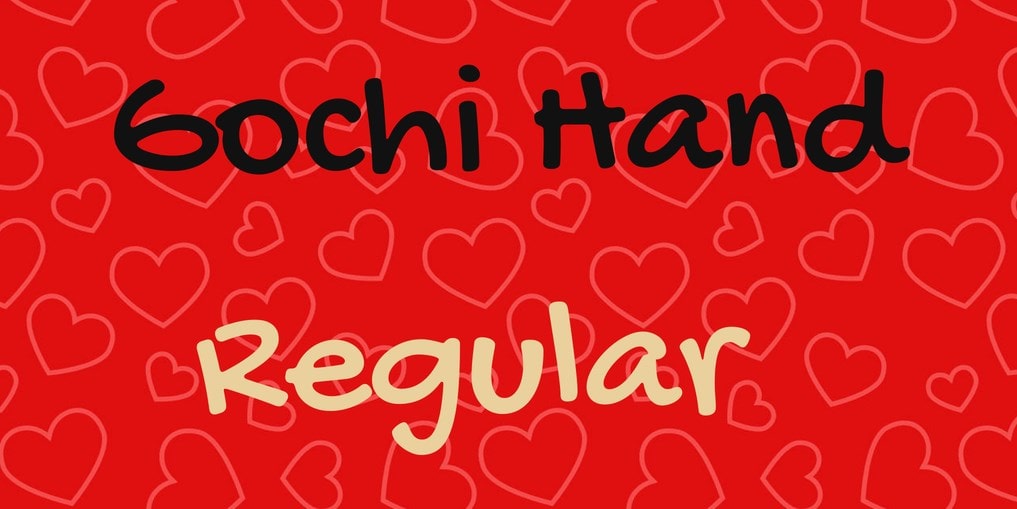
11.Gochi Hand
Source: https://fonts.google.com/specimen/
License: Free for commercial use
Gochi Hand is a typographic interpretation of the handwriting of a teenage girl. The style is fresh, not like the letters made by a calligrapher, but those of an ordinary person. The text line is spontaneous but solid and consistent, expressive, and works well on screen, even in small sizes.
The glyphs were carefully designed with a good curve quality that made them look good when printed. It is designed by Juan Pablo del Peral for Huerta Tipográfica.
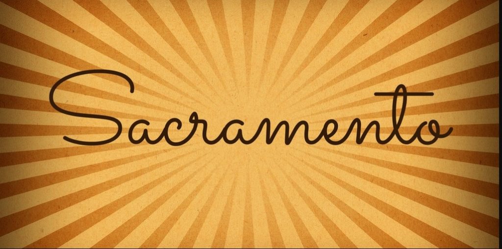
12.Sacramento
Source: https://fonts.google.com/
License: Free for commercial use
The Sacramento typeface is a monoline, semi-connected script inspired by hand-lettering artist brochure work of the 1950s and 1960s. It stands on a thin line between formal and casual lettering styles, yet it has a commanding presence for headlines and titles.
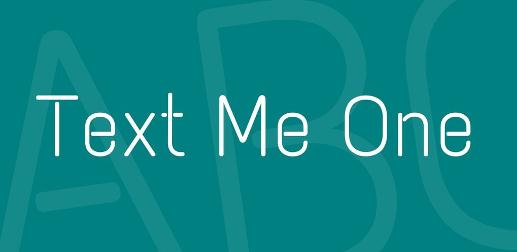
13.Text Me One
Source: https://fonts.google.com/
License: Free for commercial use
Text Me One is a monolinear font that plays with the shapes of open counters and un-connecting lines: a relatively large x-height and prominent in-strokes and out-strokes aid legibility.
Its flavor is playful, with a hint of pop, and is ideal for large format lettering or continuous body text. I recommend it when using music and related videos.
14.Lato

Source: https://fonts.google.com/
License: Free for commercial use
Another sans-serif font that will make your videos look professional and sleek. It’s a little more stylized than, so if you’re looking to add a bit of a twist to a more serious topic (like a professional ‘how to’ video), you might want to give this one a try.
Remember that sans-serif fonts are usually a better option for subtitles, as they are easier to read than serifs.
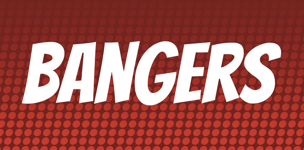
15.Bangers
Source: https://fonts.google.com/
License: Free for commercial use
If you’re feeling adventurous – comic fonts are an excellent way to go! Inappropriate use of mostly Comic Sans has given them a bit of a bad rep, but these typefaces are a fantastic way to draw people’s attention to videos.
Bangers, for example, will give your thumbnail a playful side while not committing you to anything overly specific. Because it’s so unassuming, it works pretty well with an array of other fonts.
16.Amatic
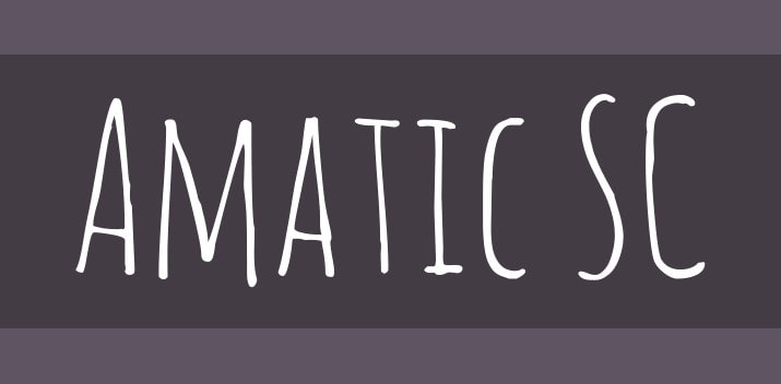
Source: https://fonts.google.com/
License: Free for commercial use
This edgy, hand-drawn font in all caps is very playful and great for cute title covers. It’s got a clean, stylized design, making it a good fit for arts and crafts tutorials and videos. It is excellent with captions as well as subtitles.
17.Bebas
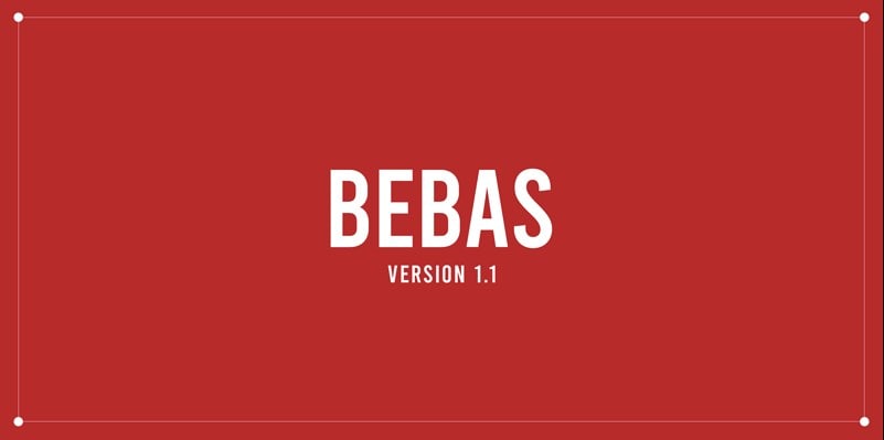
Source: https://www.dafont.com/bebas.font
License: Free for commercial use
This font is another simple yet powerful font that works very well when you want to highlight the title. Bebas looks excellent in both thumbnails and eye-grabbing banners. An updated version of this now the practically classic font is Bebas Neue, characterized by more slender letters set closer together.
18.Impact
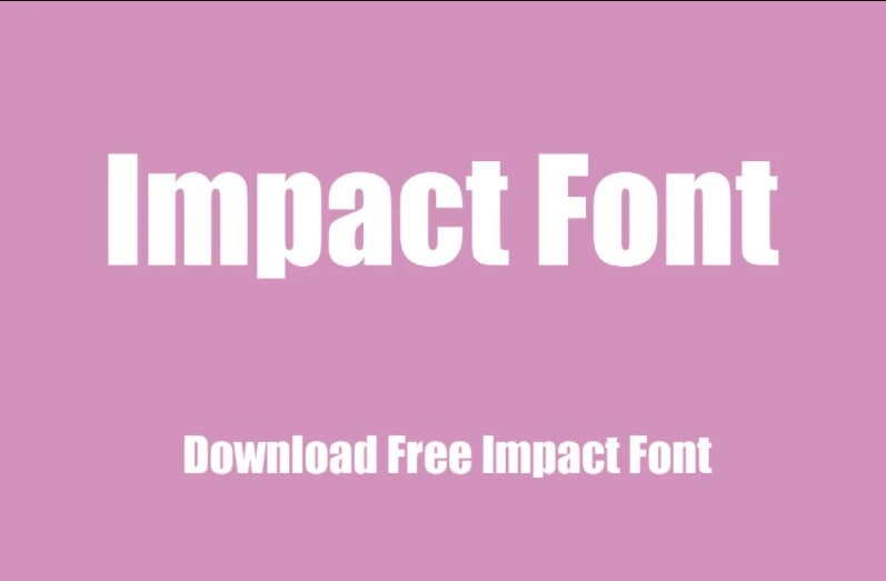
Source: https://www.wfonts.com/font/impact
License: Free for commercial use
This simple, bold font is a great place to start as you also usually have it on your computer. And if you’re looking for a celebrity endorsement, Impact has got a big one. This font is aptly named—the ornaments can make it seem very gentle, and still, it can make a striking, bold title font.
19.Benguiat Bold – Stranger Things Font

Source: https://famfonts.com/stranger-things/
License: Free for commercial use
This one needs no introduction. Whether you’ve watched Stranger Things or not, their famous title font has become one of the most recognizable typefaces in contemporary pop culture. We recommend adding an outer glow effect to the text to achieve the show’s classic eerie atmospheric look when you use it.
20.Cooper Black
Source: https://fontsgeek.com/fonts/Cooper-Black-Regular
License: Free for commercial use
Whether it’s on an album cover, corner store awning, or the Tootsie Roll wrapper, Cooper Black is everywhere. It’s has been around for almost a century and isn’t going anywhere – making it the perfect font for any retro aesthetic.
21.Raleway
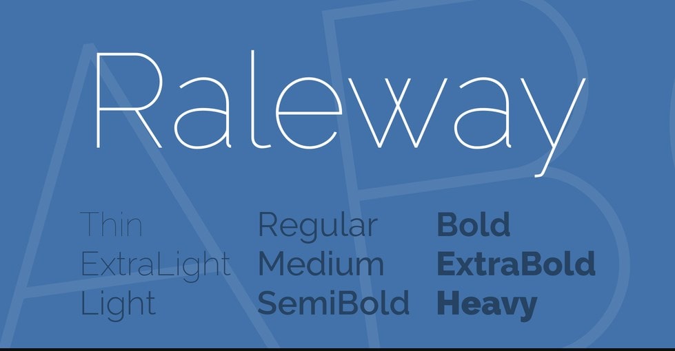
Source: https://fonts.google.com/specimen/Raleway
License: Free for commercial use
The Raleway family of fonts comprises simple, minimalistic San Serif fonts. This family of fonts is versatile, owing to its simplistic design. Thus, you can use it for any video.
It is a display face. The download features both old style and lining numerals, standard and discretionary ligatures, a pretty complete set of diacritics, and a stylistic alternate inspired by more geometric sans-serif typefaces its neo-grotesque inspired default character set.
22.Special Elite
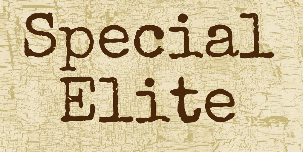
Source: https://fonts.google.com/specimen/Special+Elite
License: Free for commercial use
The Special Elite typeface has an intentionally scruffy old-school design, which gives it a weird vintage military feeling. This type of fonts shines in lifestyle videos. A little bit of inked-up grunge and a little old-school analog flavor work together to give you a vintage typewriter typeface for your website and designs.
23.Trade Winds

Source: https://fonts.google.com/specimen/Trade+Winds
License: Free for commercial use
Trade Winds comes with a total dose of adventurous energy. Its breezy yet bold design makes it suitable for fun-filled, simple headlines, captions, and titles.
24.Quicksand
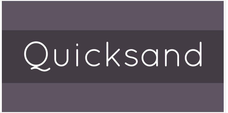
Source: https://fonts.google.com/specimen/Quicksand
License: Free for commercial use
Quicksand is a family of sans serif fonts with slightly rounded edges. It is designed for display purposes but can be used in small sizes as well. Quicksand is a display sans serif with rounded terminals.
25.Oswald
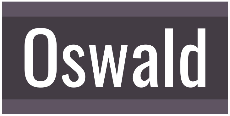
Source: https://fonts.google.com/specimen/Oswald
License: Free for commercial use
Oswald is a remodeling of the classic “Alternate Gothic” Sans Serif typefaces. The characters of Oswald were initially re-drawn and reformed better to fit the pixel grid of standard digital screens.
26.Montserrat
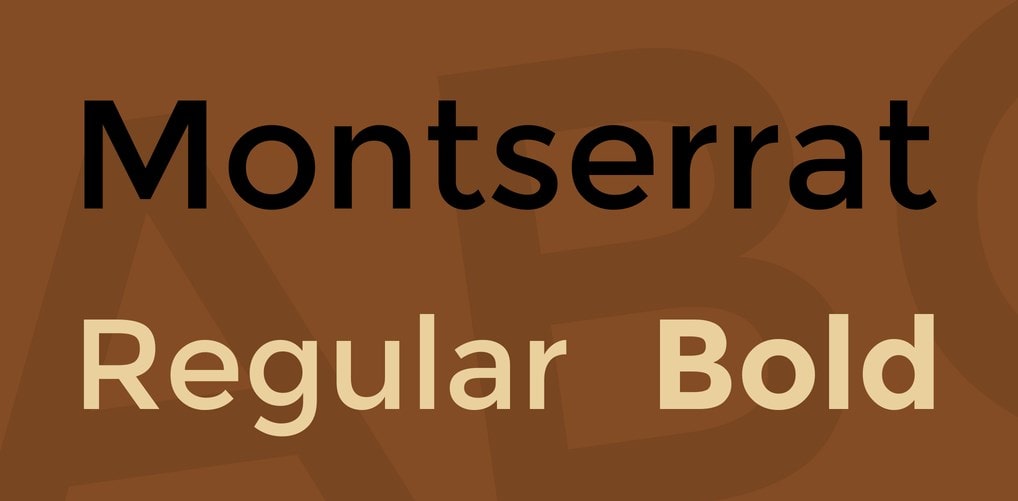
Source: https://fonts.google.com/specimen/Montserrat
License: Free for commercial use
Montserrat is a Sans Serif font family with a simplistic design. This font makes it suitable for videos created for legal purposes.
27.Cunia
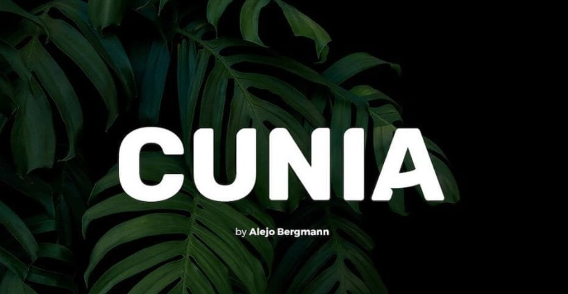
Source: https://www.pixelsurplus.com/freebies/cunia-free-font
License: Free for commercial use
Cunia is a Sans Serif font with slightly curved edges. Its design makes it suitable for several display purposes, including logotypes, headlines, labels, and more.
28.Josefin Sans
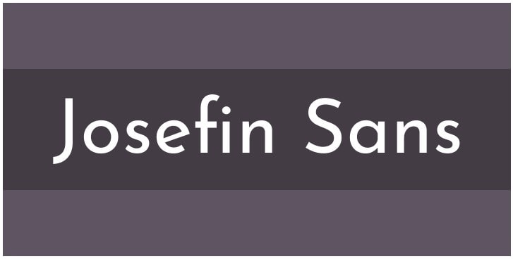
Source: https://fonts.google.com/specimen/Josefin+Sans
License: Free for commercial use
Josefin Sans is designed to be an elegant, geometric San Serif typeface with a vintage feeling. Its simplicity makes it adaptable to any video. It is inspired by geometric sans serif designs from the 1920s.
29.Loved by the King
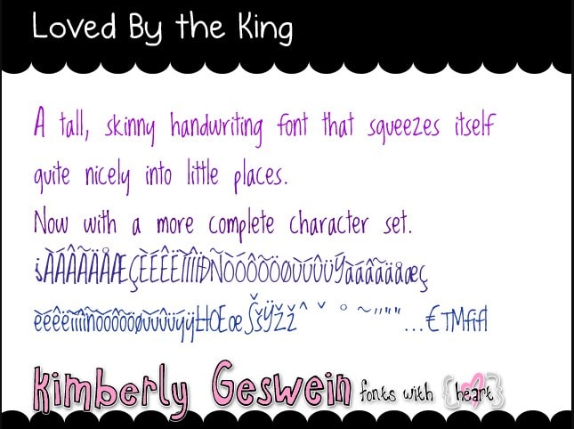
Source: https://fonts.google.com/specimen/Loved+by+the+King
License: Free for commercial use
This family of fonts is suitable for storytelling owing to its retro design. It is pretty compact, a feature that allows it to fit into small spaces. It’s a skinny font that fits in tiny places.
30.Museo Moderno
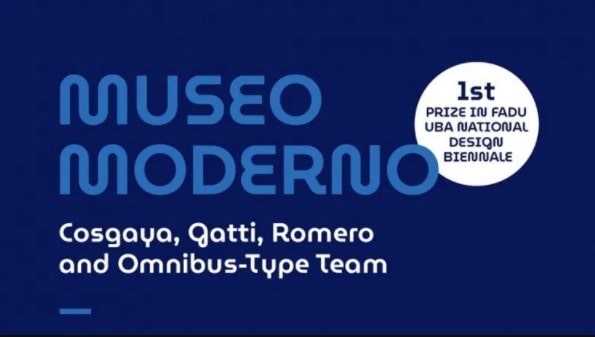
Source: https://fonts.google.com/specimen/MuseoModerno
License: Free for commercial use
Museo Moderno tries its best to merge the energies of contemporary and historical typography into one unique typeface. It was essentially designed to represent the new identity of the Buenos Aires Museum of Modern Art.
31.Arca Majora Font
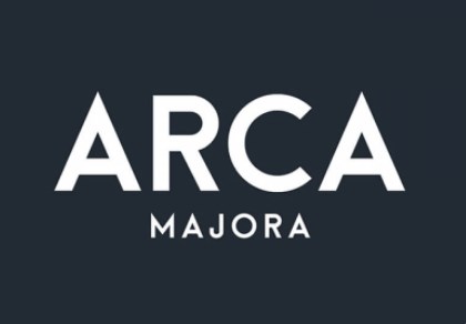
Source: https://uispace.net/367-arca-majora-font-free-Font
License: Free for commercial use
Arca Majora is a simple font designed by Alfredo Marco Pradil. With sharp tips and bold stems, you can use this typeface for high-impact communication through your videos, especially for your promo videos and video ads. It is sometimes used for headlines, logotypes, posters too.
Subtitles and captions are everywhere in design. At some points, you will need to add a subtitle or captioned element to a design project. Whether you’re looking for class or sass, fonts can help you. Think of your audience, goals, and inspiration—and don’t forget to experiment. If used correctly, a very clean basic font can be as impactful as a more creative option.
Above is a list of fonts you can use to enhance your subtitles in a way you want.