Typography is key in our lives, sometimes we do not perceive its importance because we constantly see them everywhere but they are more important than we think. Their shapes influence us and transmit feelings, they make us remember images and concepts just by looking at the shape of the typeface. In the world of graphic design, typography in texts is one of the great pillars of communication. One of the great evident examples of its visual strength is found in the design of movie posters, where it is the reference of many and the distinctive element.
The cinematographic world knows how to use typography in its posters so that it is not indifferent to the public, the style of the title or name of the film is its hallmark, in addition to the background image it uses.
Here we tell you about the 50 awesome movie poster fonts you should know but before starting, please notice that many original movie fonts are not available although you can download them from different websites created by alternatives designers.
#1. Matrix – Movie Posters Fonts
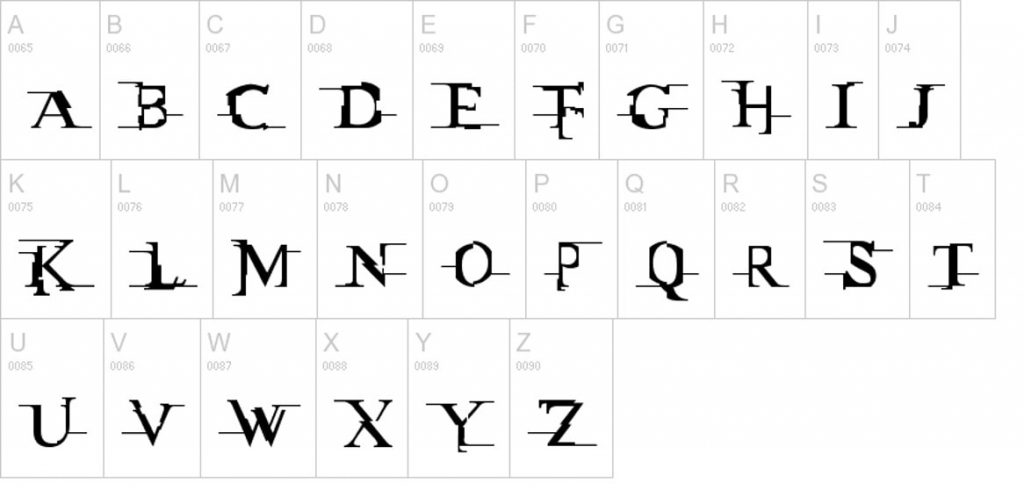
It transmits the distortion of reality as the antlers of the letters are cut off as if they were cuts of time and movement, which is the essence of the Trilogy. It is clear that it starts from a classic Times font. There is a similar typeface called “Miltown” designed by Apostrophic Labs that turns the entire alphabet into moving letters, they have done a good job.
- Font name: Miltown.
- Price: Free.
- License: Personal and commercial.
#2. Star Wars
Thanks to the power of the ITC Serif Gothic Std Heavy font, George Lucas has been conquering his entire audience for decades, the great typographic emperor differentiates himself by using a yellow outer line and joining the S with the initials and lengthening them to give the effect of speed of galactic ships taking off.
An unforgettable, branding film title with just a few tweaks. Another distinction is the intro of the films where he also uses a News Gothic with such a particular perspective that it takes us into the galaxy.
Note: Keep in mind that Star Wars has been changing its typeface since, in the beginning, the font used was designed by hand and over time, it was computerized showing certain changes, so here, you have some font options.
Font name (First): ITC Serif Gothic Std Heavy
Price: $35
License: Personal and commercial
Source: MyFonts
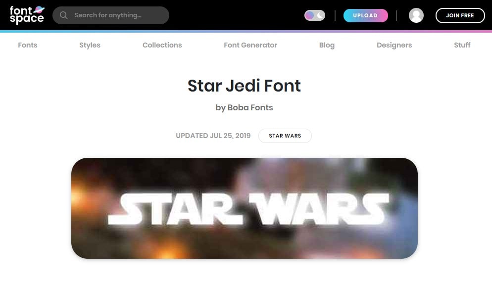
Font name (Second): Star Jedi
Price: Free
License: Freeware
Source: Fontspace
#3. 28 Days Later
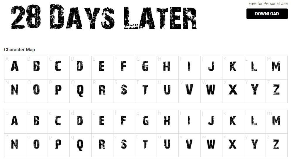
With a sans-serif typeface designed by Jens R. Ziehn, with a visible worn line that transmits metal, harmful and resounding, which together with the circular elements in the background (which maintain the same effect) transmits a shocking and aggressive film.
- Font type: Sans-Serif.
- Price: Free.
- License: Free for personal use.
#4. Alice in Wonderland
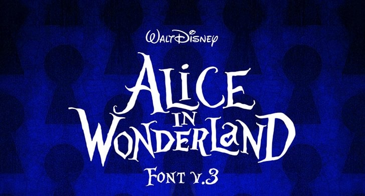
Tim Burton often uses fonts that have great character, making a difference with letter horns that simulate broken branches because, like his films, beauty and goodness are found in what we usually reject or find broken. We can see it in Alice in Wonderland, which transmits imperfection and life by dancing the letters between them using different sizes. The movie has its own font.
- Font name: Alice in Wonderland.
- Price: Free.
- License: Free for personal use.
#5. Ice Age
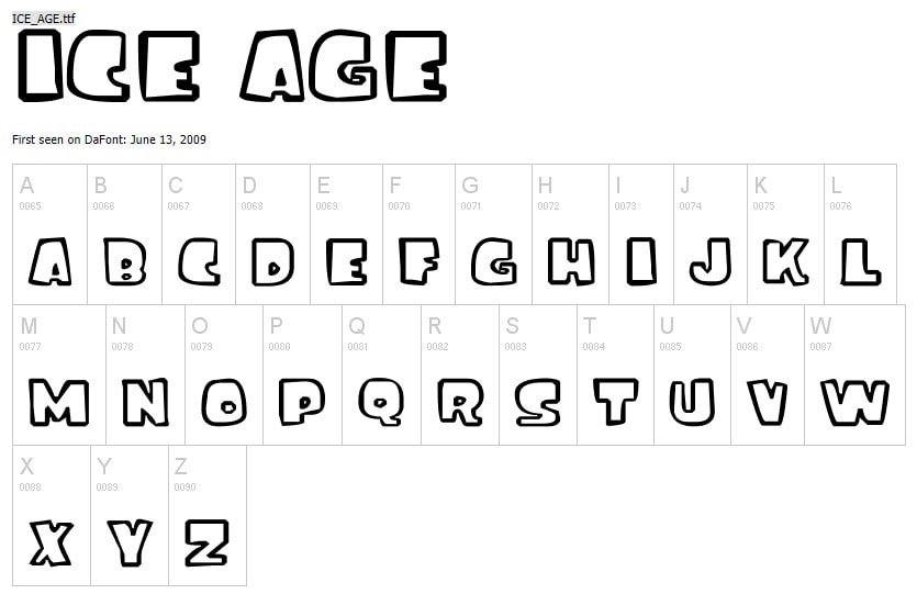
Typography designed by Florian Doyen does not leave indifferent for its robust strokes as if they were blocks of ice cut into pieces, the unevenness of the thickness and the use of more mass in the upper and left part of the letters, makes it have that feeling of weight and a very beastly aspect that conveys the theme and humor of the film. The game with such imperfect shapes reminds the child world that they connect with it. A great success with this font and a great film that was very successful for both adults and children.
- Font name: Ice Age.
- Price: Free.
- License: Personal and commercial.
#6. Jurassic Park

Another film directed by Steven Spielberg, applied a typeface designed by Filmfonts, with double lines and using imperfect straight lines that remind us of branches or sticks that allow you to move to a primitive world that, together with the skeleton of the tyrannosaurus rex in its logo, transmit a wild message. Now, you can also download it for free.
- Font name: Jurassic Park.
- Price: Free.
- License: Free for personal use.
#7. Harry Potter
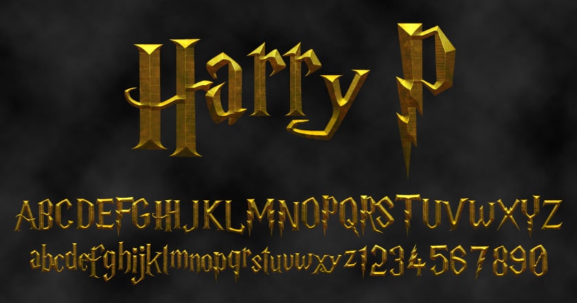
Although much more current than the previous one, this adaptation of the novels by J.K. Rowling known worldwide, knew how to make a very wise choice of the font, which is characterized by having the capital P with a lightning design that simulates very well the scar on the magician’s forehead.
- Font name: Harry P.
- Price: Free.
- License: Personal and commercial.
- Additional Harry Potter’s fonts: HarryPotterFanZone
#8. 300
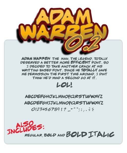
An emblematic and very visually striking film, because it is based on a comic where they did not stop using free-stroke typography. Press Gang Studios, its creators, thought of keeping at 300 the stroke of the blood that falls in the fight, full of splashes and an intrinsic movement when lengthening the numbers, which transmit that movement of sword fighting. The movie has its own font but you can download the alternative one.
- Font name: Adam Warren
- Price: Free.
- License: Free for personal use.
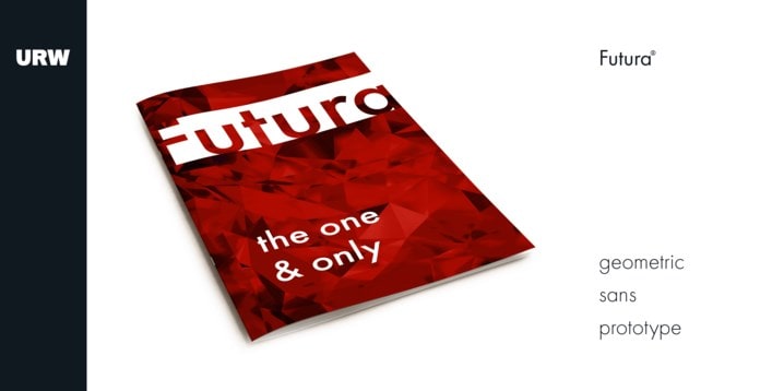
#9. 2001: A Space Odyssey
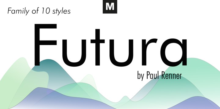
This science fiction film directed by Stanley Kubrick (in 1968), marked a milestone for its visual communication style, its revolutionary special effects, its scientific realism, and its avant-garde projections. The font used in this film is Futura, designed by Paul Renner in 1928. Its design later inspired all the new geometric typefaces of the 20th century.
- Font name (First): Futura
- Price: $65
- License: Personal and commercial
- Source: Fonts
- Second Option at price $29
- License: Personal and commercial.
- Source: MyFonts
#10. Amelie
A film directed by French Jean-Pierre Jeunet tells the life of waitress Amélie (Audrey Tautou) who decides to change her life the same day that Lady Di dies in a traffic accident. In this case, the font used is Champion™ BQ, designed by Günter Gerhard Lange for the Berthold company in 1957. This font resembles a handmade typeface and fits very well with the film since the protagonist is sweet and dreamy.
- Font name: Champion™ BQ
- Price: $55
- License: Personal and commercial
- Source: BertHoldTypes
- Second option (Free)
- License: Free for personal use.
- Source: AZFonts
#11. Avatar
Science fiction lovers were amazed by this movie, its poster has been as successful as the movie and its typography, of course, is part of that success too. This typeface is called Papyrus and it was designed by Chris Costello, which has not only been used in the official title of the film, but also in the subtitles used every time the Na’vi use their language. This font presents texture and gestures in the line, like wild nature, ancestral tribe.
- Font name: Papyrus Regular
- Price: € 39
- License: Personal and commercial
- Source: LinoType
- Second option for free
- License: Personal and commercial
- Source: Download Free Fonts
#12. The Shining
The film adaptation of Stephen King’s novel hit theaters in 1980 but it is still alive in the hearts of horror lovers, apart from how can we forget the iconic scene where Jack Nicholson places his face over the hole in the door. And the font used, should inspire that fear, that’s why Saul Bass used a font very similar to Shining NFI Demo, and we say similar because the designer keeps his original name in secret.
- Font name: Shining NFI Demo
- Price: Free
- License: Free for personal use
#13. The Exorcist
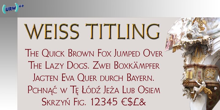
The exorcist has terrorized entire generations, but what about the font used? It is serious, almost universal, with a blood-red that anticipates the unnameable to whoever is viewing it. The poster is enough to awaken in the viewer the most appropriate state of mind to watch the film: restlessness. The font was designed by Dan Perri using the Weiss Titling font.
- Font name: Weiss Titling
- Price: $35
- License: Personal and commercial
#14. The Lord Of The Rings

The Ant Farm specially created the font design for the poster for this movie called Sauron but it is not available for public use. Still, there is an alternative created by Pete Klassen that is very similar to the original, called Ringbearer.
This font is very sophisticated, in a golden color that refers to kingdoms and of course, the ring. Although the font of the main poster of the film is in 3D, you can see the relief on the letters that refer to a sword.
- Font name: Sauron/Ringbearer
- Price: Free
- License: Free for personal use
#15. Rocky
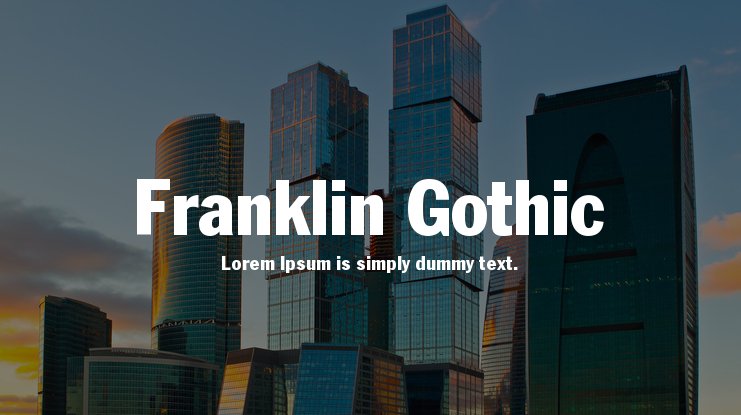
Due to its success, several more films were shot, although if you are a fan of this saga you will only recognize it as such until IV. The font used in this film is an old familiar one: Franklin Gothic, a robust and simple font.
- Fon name: Franklin Gothic.
- Price: Free.
- License: Personal and commercial
#16. Terminator
The font used in the poster of this movie is undoubtedly an icon and is differentiated by the position of the ”A”. Although, as the saga progressed, each font changed color from metallic effects with a futuristic touch to a more sober font (Terminator 2) but always respecting the same design.
- Font name: Terminator Real NFI
- Price: Free
- License: Free for personal use
#17. Parasite
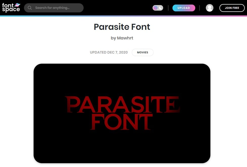
The South Korean film Parasite is a mix between black humor and horror and uses various fonts in its poster where the classic and the modest are reflected. The font is capitalized using the Gotham font but which has been customized with old-style serifs on various terminals. Another font used is the Garamond and the Linotype Didot.
- Font name (First Option): Gotham (customized)
- Price: Free
- License: Personal and commercial
- Source: FontSpace
- Font name (Second Option): Garamond
- Price: Free
- License: Personal and commercial
- Source: cufonfonts
- Font name (Thirst Option): Linotype Didot
- Price: $35
- License: Personal and commercial
- Source: MyFonts
#18. Kong: Skull Island
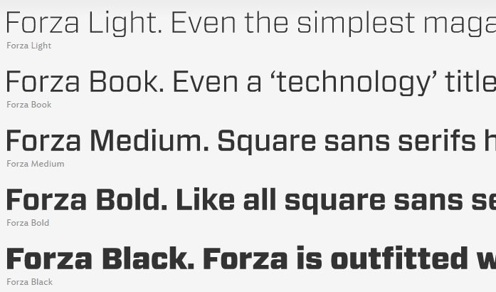
As with other films, the font used in the Kong: Skull Island poster is self-created, specific to the film, but it can be seen that the original font used has been Forza Black, a robust font, bold, with a lot of solidity and some changes in the letters K and G as if you were arrowheads.
- Font name: Forza Black
- Price: $199
- License: Personal and commercial
#19. Justice League
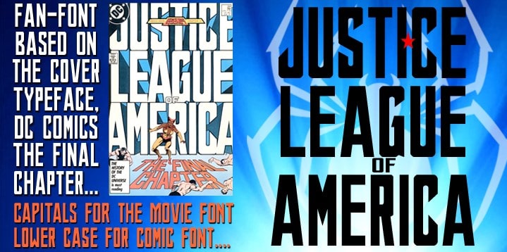
The Pentagram design studio has designed the identity of the film, building on the heritage of DC comics to create a powerful font that captures the spirit of this team of mythical characters creating the typeface known as Justice League Super Condensed, designed in collaboration with Jeremy Mickel. The original font is not available but here you have some alternatives.
- Font name: Justice League Super Condensed
- Alternative1: League Gothic
- Alternative2: Justice League
- Price: Free
- License: Personal and commercial
- Source: FontSquirrel
#20. The Nice Guys
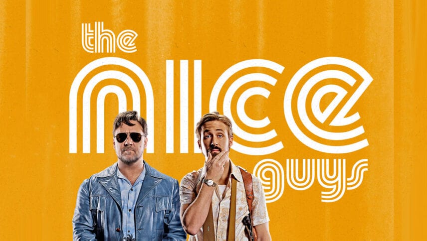
The font used in this movie is Pump Triline, a trademark font designed by Philip Kelly. The font matches perfectly with the poster’s movie, which reflects the 70’, a disco time.
- Font name: Pump Triline
- Price: Free
- License1: Personal and commercial
#21. Lost in Translation
A film was written and directed by Sofia Coppola. Set in Tokyo and starring Bill Murray and Scarlett Johansson. The typeface used in the poster corresponds to the heavyweight version of “Kabel”; a geometric sans-serif designed by Rudolf Koch.
- Font name: Kabel
- Price: $35
- License: Personal and commercial
#22. Apocalypse Now
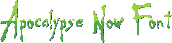
War film directed by Francis Ford Coppola (in 1979) based on the novel by Joseph Conrad Heart of Darkness. A movie that has been a success with a font designed by Jens R. Ziehn which has a great irregular texture and transmits horror.
- Font name: Apocalypse Now
- Price: Free
- License: Free for personal use
#23. Austin Powers
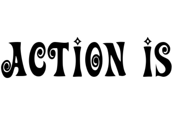
In this comedy written and produced by actor Mike Myers and directed by Jay Roach, they chose a lighthearted typeface called Action Is. This font fits very well with the colorful poster set in the ’70s.
- Font name: Action Is
- Price: Free
- License: Free for personal use
#24. Back To The Future
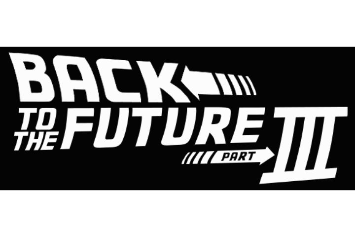
Back to the future remains indelible in the memory of many, yes, that story about a teenager who travels in time to the recent past to see his parents as teenagers and who lives thousands of adventures. A film with a lot of success that it had 3 parts. Its success is also tied to its font on the poster, a font that makes a lot of sense and matches perfectly with the story.
- Font name: Back to the Future
- Price: Free
- License: Free for personal use
#25. Batman Forever
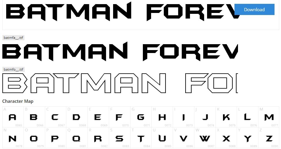
The font used on the 1960s Batman Forever poster is a bit different from the 90s. This one keeps its bold style but has uneven finishes.
- Font name: Batman Forever
- Price: Free
- License: Free for personal use
#26. Corpse Bride
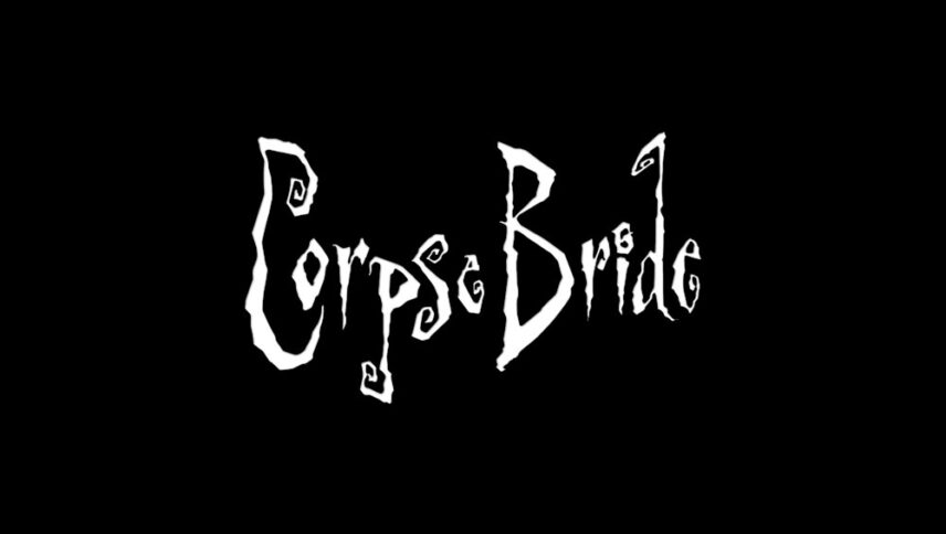
True to Tim Burton’s style, Corpse Bride couldn’t be any different: the complex interplay between light and dark and being trapped between two irreconcilable worlds. And the font is not exempt from Burton, a defender of Gothicism since he once again uses a typeface that characterizes him, an authentic and unique one that transmits fantasy.
- Font name: Beynkales
- Price: Free
- License: Free for personal use
#27. Alien
An arial bold font with an unusual separation between its characters is part of this poster together with an egg in the background. With these ingredients, Frankfurt Gips Balkind brought to life one of the best posters ever.
- Font name: Arial bold black
- Price: Free
- License: Personal and commercial
#28. American Beauty
Again, an excellent combination of a powerful image in conceptual terms that perfectly describes the central themes of the feature film and a very accurate and enigmatic font that invites us to “take a closer look”.
- Font name: Futura Book/Futura Bold
- Price: $35
- License: Personal and commercial
#29. Anatomy of a Murder
Saul Bass did a magnificent job on the poster for ‘Anatomy of a Murder’, in which the uneven and unbalanced typography and the imperfect dismemberment of the body invite us to think about the inconsistencies of the story of a client who could be lying to his lawyer. The original font is not available but there is an alternative.
- Font name: Will Robinson
- Price: Free
- License: Personal and commercial
#30. Ghostbusters
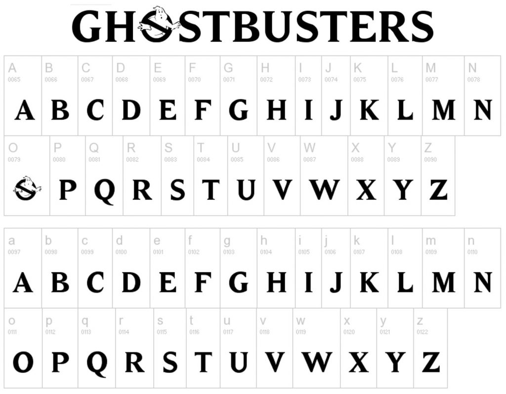
Another very successful sci-fi movie. It is a fantastic comedy, produced and directed by Ivan Reitman. Its logo was well known in the 80s and 90s and for that reason, its font – designed by Kevin Wilson – deserves to be on this list even if it is a custom font.
- Font name: Ghostbusters
- Price: Free
- License: Free for personal use
#31. Indiana Jones
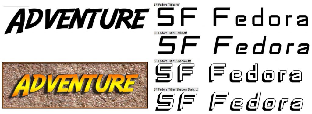
Reference to adventure films, Indiana Jones is a fictional character created by film director George Lucas and played by actor Harrison Ford. As with the title of Ghostbusters, that of this tetralogy does not go unnoticed. The font used is SF Fedora although there is another very similar one, Adventure.
- Font name: SF Fedora
- Alternative: Adventure
- Price: Free
- License: Free personal use
#32. Schindler’s List
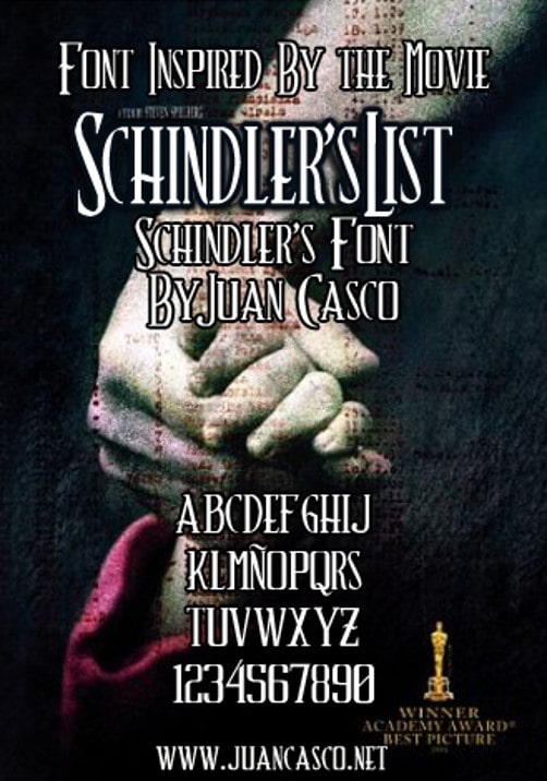
A film directed by Steven Spielberg, a film that touches hearts and relives the Holocaust era. The original font chosen in this case is not available but there is an alternative.
- Font name: Schindler’s Font
- Price: Free
- License: Free for personal use
#33. La La Land
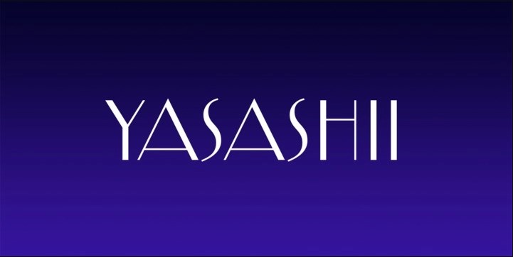
As expected, the font used in this poster has been created specifically for this movie so it is not available although you can always find an alternative. This font is sober, clean, interesting, alluding to Jazz.
- Font name: Yasashii
- Price: $14.99
- License: Personal and commercial
#34. Logan
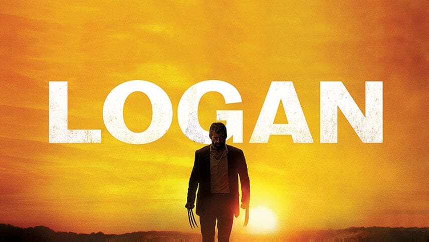
This font is robust, sober but also informal. It has been created specifically for this movie and had to keep the line of the X-Men.
- Font name: Maple
- Price: Free
- License: Personal and commercial
#35. Narnia
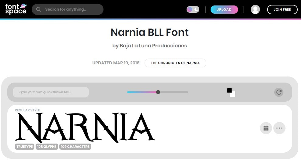
The Narnia poster is spectacular and its font appears in perfect harmony with both its design and the history that it wants to reflect. The original font conveys elegance, struggle, and fantasy.
- Font name: Narnia BLL
- Price: Free
- License: Free for personal use
#36. Hacksaw Ridge
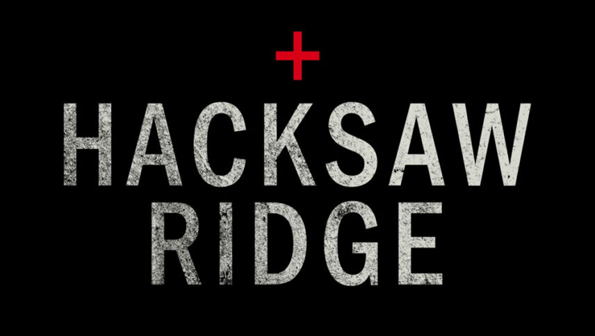
Although many of today’s war movies have been inspired and even adapted from previous years, the font type is often modern. In this case, a discreet and highly legible font was used on this poster.
- Font name: Fette Engschrift D
- Price: $35
- License: Personal and commercial
#37. The Salvation
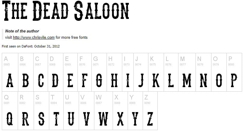
The font of this poster perfectly matches the image of the poster and the story that is conveyed. This font has been perfectly personalized with a vintage touch ideal for the era of the Wild West. Here you have two alternatives.
- Font name: The Dead Saloon
- Alternate: Gunfighter Academy
- Price: Free
#38. Loving
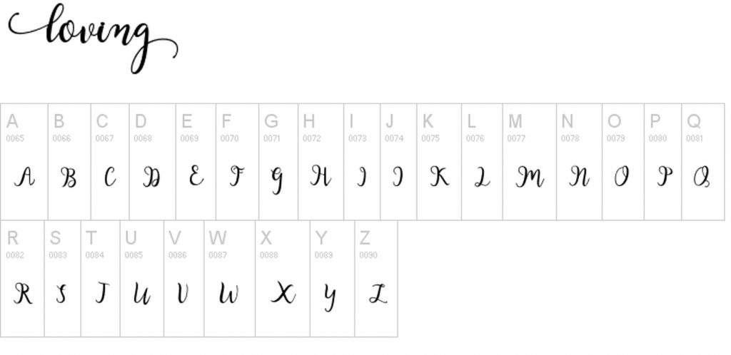
Again we can see how the font blends perfectly with the image of the poster. We are talking about a romantic, elegant font with a touch of nostalgia.
- Font name: Adobe Caslon Pro Italic
- Price: $35
- License: Personal and commercial
#39. The Lobster
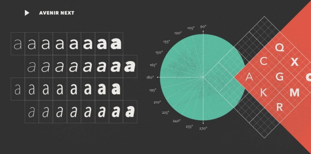
The poster of this film conveys intrigue to the viewer, who uses a modest font trying to reinforce the harshness of the message: the fear of being left alone.
- Font name: Avenir Next
- Price: $49
- License: Personal and commercial
#40. The Addams Family
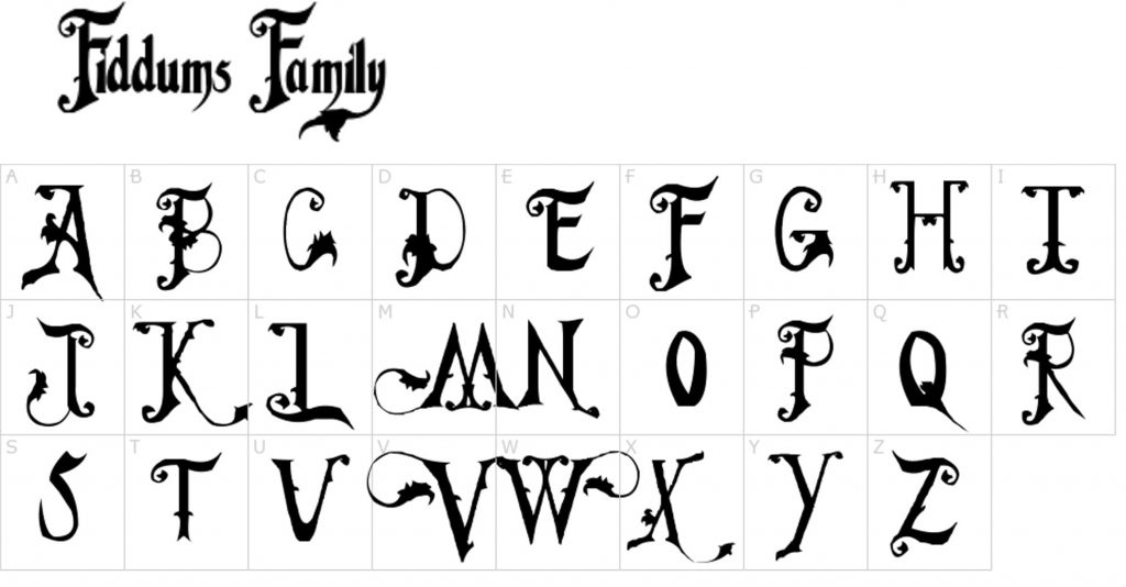
One of the most prominent families in movies also needs a prominent font. This font has been personalized and adapted to inspire class, horror, and black humor.
- Font name: Fiddums Family
- Price: Free
- License: Personal and commercial
#41. The Shape of Water

Taiwanese designer James Jean created the poster for this film using a simple, linear and-serif font with lots of personalities.
- Font name: MB Vintage Medium
- Price: $25
- License: Personal and commercial
#42. Lady Bird
The font used in the poster of this film has a colonial touch although the film itself is not set at that time. Still, it refers to the fact that the protagonist attends a Catholic school.
- Font name: Amador Regular
- Price: $25
- License: Commercial
#43. Dunkirk
This war movie used a strong, bold font without much detail. It is a minimalist font, located in the center of the poster, a dramatic font to impress.
- Font name: Formula Extra Bold
- Price: Free
- License: Free for personal use
#44. Call Me By Your Name
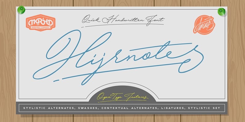
Romance and drama cannot be lacking in European cinema, nor a font that matches it. Therefore, the Hijrnotes Regular is the font that best fits this poster. A font that resembles handmade calligraphy, a romantic font.
- Font name: Hijrnotes Regular
- Price: Free
- License: Free for personal use
#45. The Post
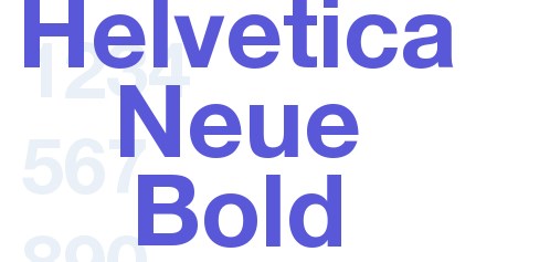
Here, we can see a typographic design where the font has all the prominence and it is impossible to go unnoticed. Thus, the rest of the composition remains clear and simple.
- Font name: Helvetica Neue Bold
- Price: Free
- License: Free for personal use
#46. Three Billboards
Generally, movies that want to draw attention to their posters use a bold style, like this poster. This is a trend that gives personality to texts that take away the prominence of the image and become the center of attention.
- Font name: Biko
- Price: Free
- License: Free for personal use
#47. Phantom Thread
The font of this poster goes very well with the story of the movie. It uses a font with thin strokes, very optimal for the time and although it has been designed specifically for this movie, here you have an alternative.
- Front name: Garamond Premier Pro Light Display
- Price: Free
- License: Free for personal use
#48. Darkest Hour
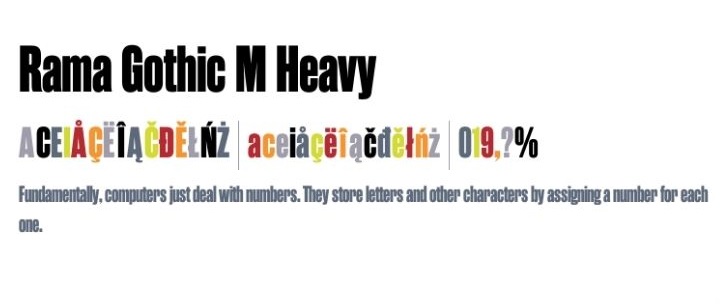
They say that the bigger the font, the better. The font used in the poster of this film is a lifelong bold, a font on a poster that does not go unnoticed and that is visible from afar.
- Font name: Rama Gothic M Heavy
- Price: $19.99
- License: Personal and commercial
#49. Aladdin
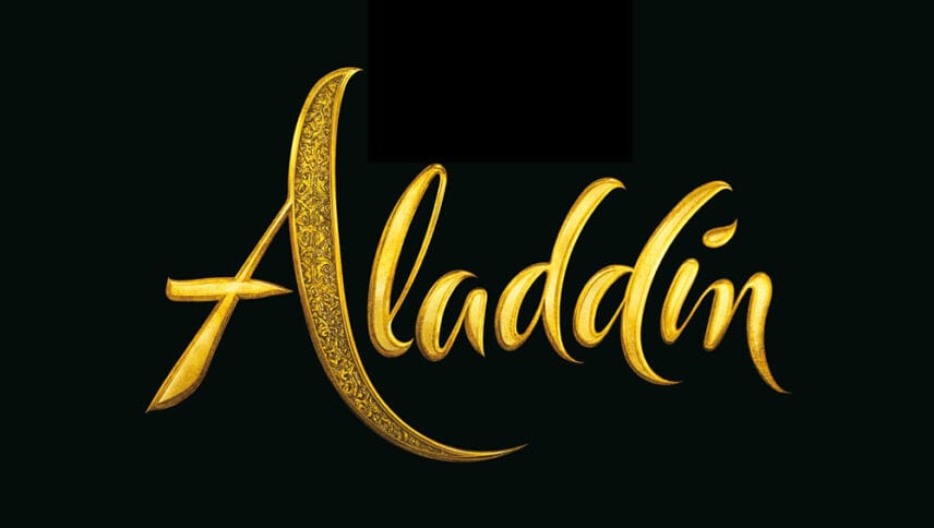
Aladdin is a Disney icon and we can see it with real characters in its movie released in 2019. It uses a romantic and very artistic font. Of course, this font has been custom designed but there are other options.
- Font name: King of Thieves
- Price: Free
- License: Free for personal use
#50. Titanic
The font of this movie has been personalized but it has a base that starts from the Trajan font, a typeface that seeks to give an epic and dramatic touch to the film.
- Font name: Trajan
- Price: Free
- License: Free for personal use
So there is the list of 50 fonts related to popular movie posters. Let us know which one you like the most in the comment below.